Saturday, 29 September 2012

Independent Experimentation

In my independent time I experimented with working on top of prints that I had made in the darkroom. I used a pin to scratch away parts of the image. I was not quite sure what I was going to scratch away, I started with the spire on the church but after thinking more carefully I thought of scratching certain parts so that it looks like the moonlight is reflecting off of the church. 
This was the second experiment I tried with scratching into the photograph. I chose a print that didn't come out well as I was only interested in the detail of the patterns scratched into it. I used a pin to scratch flowers and leaves into the photograph.
 I wanted to take this experiment further so I drew flowers onto a piece of plastic and placed it over the photographic paper whilst exposing the photograph. For the second photograph I drew ducks onto a sheet of plastic so it looked like they were in the water. The third experiment I used tracing paper and drew buildings on it. 


Digital Experimentation - Solarisation

I experimented with solarising in Photoshop. I created this by following a tutorial
Step 1 - Open the image in Photoshop. If its in colour go to layer > new adjustment layer > black and white.
Step 2 - go to layer > new adjustment layer > curves. Select the pencil - output at 0, holding shift click and move your cursor to top of the middle line. Whilst still holding shift click the bottom right hand corner. 
Step 3 - Create another curves layer. Using the normal wave tool adjust the curve according to the tutorial.
Step 4 - Create a new layer. Go to image > apply image. Using the Burn tool with your chosen size and hardness, go over section that you want your dark tones to come through. Using the Dodge tool to lighten areas. 
This was my first experiment with solarising on photoshop. I thought it would work well because it has good contrast but I think it is too light even after dodging and burning areas. I like the clouds as they look like they are glowing. I think the church would have looked better if it has more contrast. 
This was my second attempt which I think worked better than my first, however I think it would look better if it had darker tones. I like that the different areas such as the building and the plants have highlighted lines around them. 
I think this was my best attempt at solarising a digital image. It worked well because it had high contrast, I think the dark sky brings out the building particularly well and makes the windows stand out. 


Darkroom Experimentation - Solarisation

Solarisation is an effect whereby the tones are partially reversed, dark areas appear light and light areas appear dark. I created this effect by choosing an image with high contrast. The first step I did was expose the image for the correct exposure time, in my case it was 7 seconds, I then placed it in the develop until the image started to appear. I then quickly took it over to an enlarger with a aperture of 2.5 and exposed my print to the light for 1 second. I then placed it back into the develop tray until I was happy with the outcome. I then moved it into the stop then into the fix and lastly wash. It was quite hard to judge whether it had worked well in the darkroom, so after I had made the print I took it outside into the light to see if it had worked well. 
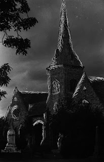
Below are some of my first attempts of solarising my prints. The church worked well as the trees are outlined with a glow and the sky is quite dark which made it have a spooky ghostly effect. I'm not quite sure what solarising is meant to look like as my prints came out different every time I tried but I am happy with what I have achieved so far.


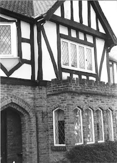
 The house came out slightly different with only the shadows being solarised.


Experimentation - Leslie David

Leslie David is a graphic designer, illustrator and art director based in Paris.  Most of her works are photographs of landmarks, streets and buildings. She is known for her series of 8 postcards called souvenirs de Paris. She had taken several pictures of places in Paris then used paint to smear over part of the photograph. Below is an example of one of the postcards by Leslie David. I like that she uses similar colours that work well with each other and spreads that paint thickly so that the texture is visible. 
Below are my examples of work inspired by Leslie David. First I selected the colours that I wanted then put blobs of paint onto a palette next to each other so that they would blend. I then took a piece of card scraped the paint off and brushed it over part of my image. I then experimented with using my finger to apply and spread the paint. I found that it was easier with using my finger but you don't get a smooth blended spread of paint. To enhance the image further I scraped into the paint with a piece of wire to enhance it with words that might describe the image.  I think that it is a good technique but personally I didn't enjoy it as I don't think it worked particularly well. If I found a new way of applying the paint and spreading it so that it looked more even and blended then I might have enjoyed it and be pleased with the outcome. 


Darkroom Experimentation - Dodging and Burning

Dodging and burning are techniques used to improve the quality of your print. Dodging lightens areas of the photograph and burning darkens areas of the photographs. The dodging tool is made by cutting a length of wire, and bending one end into a loop. I then covered this loop with black paper so the light wouldn't shine through and just stuck this down with masking tape. 
 Above is the original print and below is the image that I dodged. I dodged the sky so that it was lighter. It is quite subtle but still effective as it makes the whole image seem lighter. 

The image above is quite dark where the wall is, I used the dodge tool to lighten the wall a bit. It is easier to see the brick work but makes the image seem faded.


Darkroom Experimentation - Press Printing

In the darkroom I wanted to experiment with press printing which is like selective development. I exposed my image for the correct time on the photographic paper. I then found some objects that would relate to my theme, I chose a selection of keys, I dipped them in the develop then pressed them down on the photographic paper. I removed the keys after a minute then carried on the printing process by moving into the stop then fix then wash. You cannot see the key shapes particularly well but where you can see them I think it worked well as within the parts that did get developed there is some depth in the sections. 

Darkroom Experimentation - Highlighting Areas

I experimented in the darkroom with highlighting certain areas of my photograph. I set up my enlarger and lined up the photographic paper with the projected image. I placed a piece of glass over the photographic paper so that the paper wouldn't move. I placed a selection of coins on top of the glass in certain areas. I exposed the image for half of the exposure time, 3 seconds, then I removed the coins and exposed the image for the remainder of the time, 3 seconds. This creates an effect where parts that the coins were are lighter than the rest of the image. I think this will work particularly well with an image with areas that should capture your eye.

Darkroom Experimentation - Vignetting

In the darkroom I experimented with creating a vignette around my images. Firstly I folded an A4 piece of black paper in half then cut out a fairly small semi-circle in the middle of the folded side of paper. Once opened out the paper had a circle cut out in the center, this is what I used to create the vignetting effect. In the darkroom I set my my enlarger with my desired negative in the negative carrier. I held the black paper a couple of inches above the photographic paper and exposed my image for 7 seconds. I moved the black card round in small circles so that the edges would become faded. I developed my print, below is the example of my print. 
I think this was quite effective using it on the church image as it made it look quite dated and old like the image is slowly fading over time. Below is another example of vignetting around a house that I had photographed. I think that the cut out circle could have possibly been larger to show more of the image on the church, but I think the small circle works well with the house.


Monday, 24 September 2012

First Film

As my theme is architecture for my first film strip I thought of different places that I could take photographs. I shot three different locations on my first film, houses around Old Coulsdon, the work house tower in Croydon, and the chapel in Queens Road cemetery. I did a test strip for my contact sheet, I has the light of f16, filter 5 and exposed each section for 1 second. After looking at my test strip I could see that I need to expose it for 8 seconds. 

 After making a contact sheet I then went onto processing some of my prints. I did a test strip of one of the photographs to see how long I should expose the image for. From the test strip I could see that I needed to expose the images for 9 seconds.


The two prints below came out particularly well with a lot of contrast because I left them in the develop for slightly longer than some of the other prints. 


Enhanced Image - Digital Manipulation - HDR Effect


I experimented with applying a HDR effect to digital photographs I have taken. I think it is effective because it brings out the detailing of brick work and the ornate windows but I personally do not like this effect as I don't like the harsh lines around it as it makes it become almost cartoon like. 

Step 1 - Open image. Duplicate background layer. Go to Image - Adjustments - Shadows/ Highlights. Increase the highlights to roughly 50% depending on the photograph, Increase the shadows a little bit less than the highlights.
Step 2 -  Click Show more options , mid-tone contrast to +60, colour correction +10. You can also adjust the width and radius of the highlights and shadows.
Step 3 - Duplicate background layer. Move to the top of the layers palette.
Step 4 - Go to Filter - Other - High Pass, radius of roughly 10 pixels. Go to image adjustments - Desaturate.  Change the blending layer mode to Overlay.
Step 5 - Go to layer - New adjustment layer - colour balance. Highlights - Drag the yellow and red up a bit, Shadows - Drag the blue, green and cyan up a bit. Adjust the mid-tones.

Enhanced Image - Digital Manipulation - Lomo Effect

To improve my Photoshop skills I experimented with adding a lomo effect to a digital photograph I had taken of Osborne House in the Isle of Wight. I followed a tutorial to create this effect. I think this works well with this particular image as it brings out the detail in the brick work.

Step 1 - Open the image in Photoshop. Duplicate background layer. 

Step 2 - Using the lasso tool draw around the main part of the image you want to be vignetted. Go to select - Modify - Feather - 250 pixels. Go to Select - Inverse.
Step 3 - Go to adjustment layers - Layers - increase the shadows and decrease mid-tones to your desired look. Go to adjustment layers - Curves - RGB to form a S curve (pull highlights up, pull mid- tones down, pull shadows down)
Step 4 - Add another curves layer - Red, pull highlights up, and shadows down, - Green, highlights up, shadows down - Blue highlights down, shadows up. 
Step 5 - Select all layers - right click and merge layers. Go to layer adjustments - Gradient Map - Black to white gradient map. Adjust the opacity down.
Step 6 -  Go to layer adjustments - Hue/ Saturation - increase saturation.
Step 7 - Merge all layers. Copy layer. Filter - Blur - Lens Blur, increase the radius.
Step 8 - Add mask - select paint brush tool with the colour black - adjust the opacity and flow to 50%. Increase brush size. Paint on the parts you want to be sharp.
Step 9 - Select background layer - Filter - Sharpen - unsharp mask, amount to roughly 95%, Radius to 5.5 pixels
Step 10 - Merge layers. Add new layer. Select a colour of grey, Fill layer. Filter - Noise - Add noise, amount 18%, uniform, monochromatic. change blending layer mode to overlay, decrease opacity. 

Tuesday, 18 September 2012

Enhanced Image - Digital Manipulation - Nashville Effect

Step 1 - Open image in Photoshop. Duplicate background layer, hide original layer.
Step 2 - Create a new layer. Change the colours to Red 247, Green 217, Blue 173. Fill the new layer with the colour, change the layer blending mode to Multiply.
Step 3 - Select the duplicated layer - Set Curves, Green output to 37, Blues 133.
Step 4 - Select Levels - The middle box type in 1.36, the end box type in 236
Step 5 - Select Brightness/ Contrast, 6 for brightness and 51 for contrast
Step 6 - Go to curves, go to green input 13, Blue input 88
Step 7 - Go to brightness/ Contrast, brightness to -6, contrast to 33
Step 8 - Go to curves, Red output 4, Blue output 14


I think my first experimentation I did of the church worked the best as the colours are even whereas with the other images I experimented with they all look quite yellow. I tried to used images that had blue sky as this would bring out the blues but as the buildings were quite yellow to begin with it washes out the blue of the skies.