I researched into different photographers and chose 5 images that interested me to analyse. The first image I chose was Ruins by George Laszlo Kovacsic. This image interested me because I liked the choice of subject matter and the angle he shot at. I like that the front of the building is still in one piece where as the back of the building is falling to ruins. I get the feeling that it was once a popular place that was the heart of the town whereas now its been neglected and left to deteriorate over time. This could show that the effect of a change in people have a knock on effect on things in the environment. As people are growing old and there's a change in their lives it effects the places around them as they become forgotten and a loss of respect. Black and White House by David Owens gave a different impression of black and white photographs. A building in black and white usually seems very eerie and quite menacing such as Dark Architecture By Brian Auer, but with the photograph by David Owens I feel its a happy place that brings the community together. I think it is because it hasn't been altered in photoshop to have different effects applied to it. Dark Architecture was one of my favourite photographs because I love the angle he shot it at and the effect he has applied. The size of the chapel itself is not as large as it seems in the picture, he shot it at 18mm with his 18-200mm lens. It has a barrel distortion at the low end so it causes the buildings vertical to converge from the perspective he was shooting at.
 The first Experiment I did for the enhanced image project was a typography experiment. I followed a tutorial to achieve my outcome. The tutorial was quite short and simple therefore making it easier to understand and quicker to grasp. I liked that you can type your own text to overlay the image which gives the image more of a narrative. I think my own experiment would look better if the font was larger.
Lin Osborn is a photographer that arranges photographs in an organised manner so that they are all in line with the same spacing between each photo. Some of her works are also arranged by colour. I experimented with using digital images that I had taken of places I have visited. I found it easy to arrange them but I don't think that it worked well with my images as they were of all different places. I think it depends on what you want to achieve from it. For example if images are being arranged in colour I think it works well if it is possible to get images with the same subject matter to vary in colours, or to have a variety of objects but have a link between colour.


< Lin Osborn
Inspired work>
I looked at the work of Geraldine Georges to create my own inspired pieces like hers. I experimented with making a hand made version and one on Photoshop. For the handmade one I used different coloured ink, cut up subject and black card. I started by splatting a dotting ink on paper and blowing it so that it could spread. I thin cut the subject into sections and cut shapes out of black card. I stuck the black shapes down then stuck the image down. I liked this as it was a hand on practical task but I think it may have looked better with a larger range of materials. For the Photoshop experiment I followed a tutorial to understand the basic steps. I was a bit hesitant with doing it in Photoshop as I don't like the program much compared to practical work but after trying out different brushes, colours and brush marks I quite enjoyed it and was pleased with my outcome.

< Geraldine Georges

Inspired work >
After looking at the work of Jamie Beck I was inspired to create my own animated GIFs. I thought of something that I could capture through continuous photographs which made me think of pouring water as I wanted to keep with something quite simple to begin with. I took continuous shots of pouring water into a glass. I took these into Photoshop to create an animated GIF by looking the images together to create a sequence. I was pleased with this outcome as I had made a simple but effective animated GIF. To take it one step further I wanted to try creating a cinemagraph like Jamie Beck does rather than Animated GIFs. This involved shooting a still shot and capturing a video. I wanted to keep with the same theme so I used the same concept of pouring water. I set up what I was capturing then took a photograph of me pouring the water into the glass. I then videoed pouring the water into the glass. I used Photoshop to create the cinemagraph. This was more complicated as it had a lot more steps to follow and it involved using tools I had not used before. I was really happy with my outcome as I did not think it would work that well but I was pleased with the way it had come out. I would have liked to take these further into creating more cinemagraphs.
The summer assignment was to continue to work with enhancing your images and continue experimentation. The artists and photographers I looked at as William Hatch Crosby, Amy Friend, Stacey Page, Quentin Jones, Rebecca Chew and Greg Sand. Amy Friend was one of my favourite artists that I looked at. Her work consists of making varied sized pin holes in selected area of the photograph. I thought it would work well with the image I chose to put pin holes in the windows and to follow the fascias around the roofing. I really liked this technique as it enhances the image and gives it a new look without detracting you away from the original subject matter.
Quentin Jones is an illustrator who makes fashion films and photographs in a cartoon style with photo-montage animation. I made my own collage inspired by Quentin Jones. I used a photograph I took of Osborne House as a back drop then cut out images from newspapers and magazines to place on top of the image. I chose images that relate to the word escape in different ways such as the traveler, plane, leopard and the skull.
After I came back from summer I started the project in more depth. For my first film roll I thought of possible locations, lighting, shot types and photographers that inspired me before I shot the film.
I developed my film and began to experiment in the darkroom with different ways to enhance the images. The first experiments I tried was vignetting, press printing and highlighting areas. The vignetting was a simple but effective technique. I cut out a circle in the centre of a piece of black card, exposed the print onto photographic paper whilst I was holding the black card a few inches above the paper and moving the paper in circular motions to create a faded edge. For press printing I dipped a selection of keys into the develop then placed it on photographic paper. Highlighting areas was a simple process of placing a selection of coins over areas of the photograph and exposed it for half of the time then I removed the coins and exposed it for the remainder of the time.
I have learn a variety of techniques and experiments in Photoshop such as HDR effect, Lomo, Nashville and vignetting. I then looked at different experiments that I could do in the darkroom and digitally. Toning prints is a simple way to enhance the images. In Photoshop I opened my image and applied a colour photo filter. For my darkroom prints I applied food colouring into the photograph and spreading it with a damp paintbrush.
Solarisation was one of my favorite experiments inspired by Man Rays solarised images. In the darkroom I exposed my print then put it in the develop until a faint image appeared then exposed it to a light for a second then placed it back in the develop. This creates a really good quick effective experiment which I wish to take forward for my final outcome. I solarised my digital images in Photoshop by following a tutorial. Comparing the digital and film solarisation I prefer the film solarisation as out can create different outcomes each time depending on the exposure time and how long it is left in the develop.


< Digital Inspired work
Darkroom Inspired work >
Dan Mountford inspired me to experiment with double exposure. Me and a couple of friends tried in-camera double exposure but it was quite hard as we could not stop the film from winding on, so we had to shoot a whole roll of film then shoot over it again. We each had 6 photographs each, only one person in our group had a good outcome from the in-camera double exposure. I tried a different way of creating double exposure called sandwich printing. This involves placing two negatives lined up with one another into the negative carrier. This worked in terms of creating a double exposure but the choice of both negatives have to be thought out as to where they work well together. I also experimented with double exposure in Photoshop by placing one image on top of the other and changing the layer blending mode to screen.
Other experimentation I carried out in the darkroom was vignetting, dodging and burning, reversals and handmade negatives.


< Dan Mountford
Inspired work >
Leslie David is a graphic designer, illustrator and art director based in Paris. She uses bright colours to cover selected parts of her photographs of Paris. To create my own work inspired by Leslie David I selected a range of coloured paints and squeezed small amounts onto a palette next to each other so that they would blend. I then took a piece of card scraped the paint off and brushed it over part of my image. I experimented with using my finger to apply and spread the paint. I found that it was easier with using my finger but you don't get a smooth blended spread of paint. To enhance the image further I scraped into the paint with a piece of wire to enhance it with words that might describe the image.


< Leslie David
Inspired work >
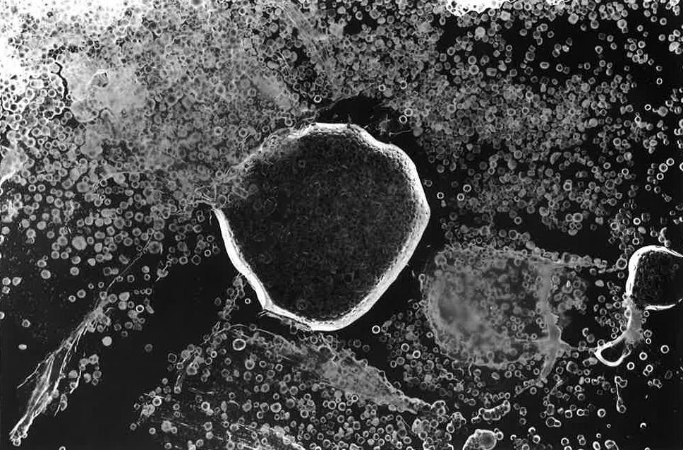
Another person I was inspired by was Curtis Mann. he work that he did that I focused my experimentation on was a project that he did by using photographs from places that he has never visited with conflict and war and subjecting them to a process of applying a resist to areas then agitating them in bleach to destroy part of the photograph. The colours the bleach make are red, orange, white and yellow, these colours reflect fire which gives his images a different meaning. To create my own bleached photographs I printed off some digital images on to photographic paper. I used clear nail varnish to apply to areas that I did not want to get disrupted. I then placed the photograph in a tray of bleach then agitated it for a few seconds. I took it out of the bleach and ran it under a tap to wash off the bleach. As my theme is architecture I think it worked well as it looked like some of the buildings were on fire which is what Curtis Mann's images depict as well.


< Curtis Mann
Inspired Work >
All the experimental work I have tried it has given me enough different ways to come up with a final outcome. I Will combine different experiments to create a better final outcome that will show my skills and the different things that I have learnt from AS to A2. For my next roll of film I have a clear idea of the different things I want to shoot considering angles, lighting and different techniques I can apply to them.