Tuesday, 3 July 2012
Abigail Reynolds
Abigail Reynolds is known for cutting into photographs to reveal a photograph behind. I think its a good idea to cut into a photograph to reveal one behind, I think it works particularly well when using contrasting photos for example a countryside and a built up city, or a photograph taken 30 years ago in contrast with one taken in the present day; they would work particularly well if the photographs are taken from the same point.
Animated Gifs
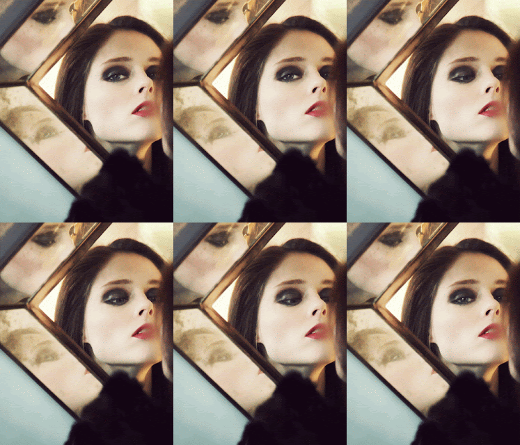
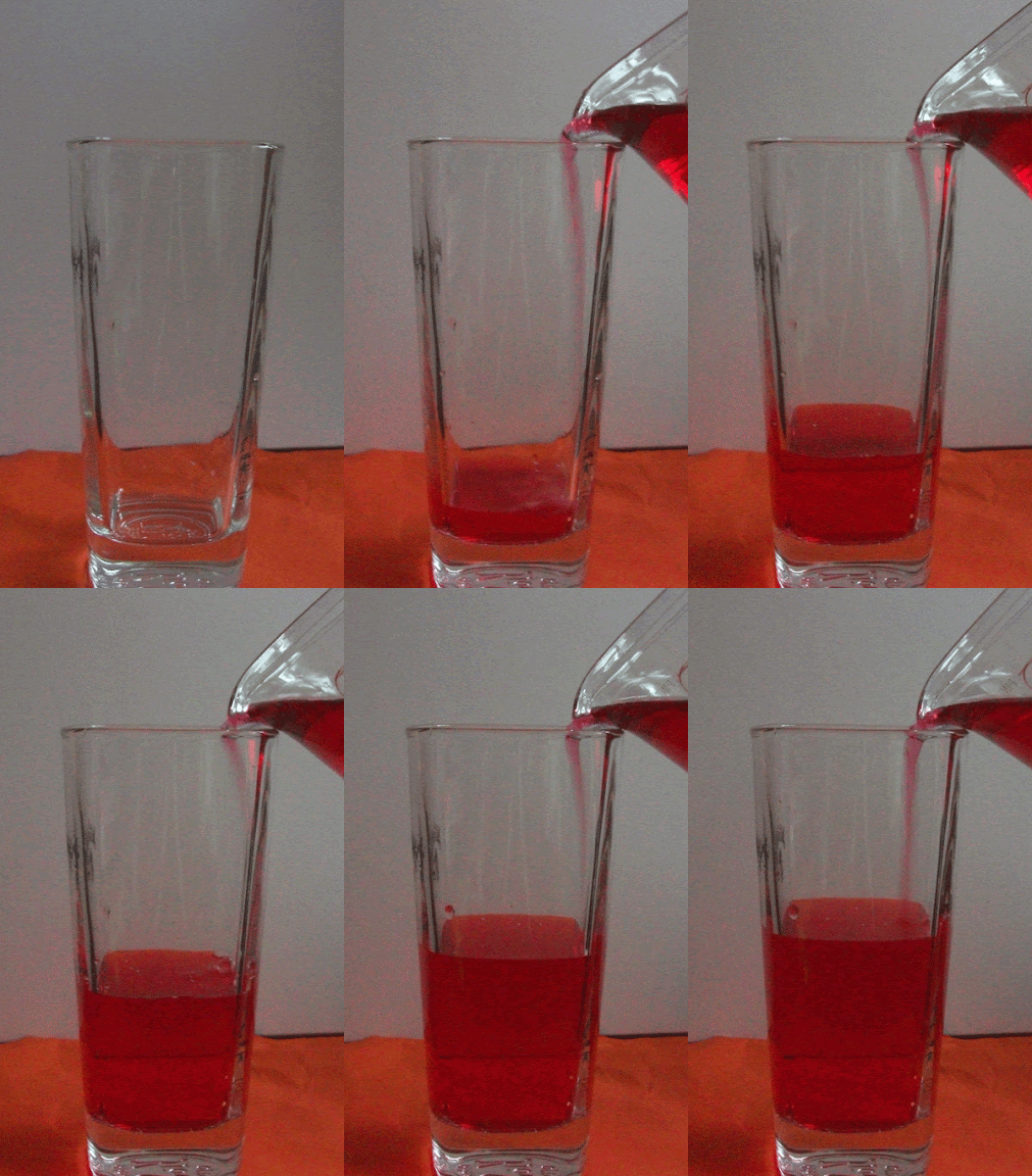
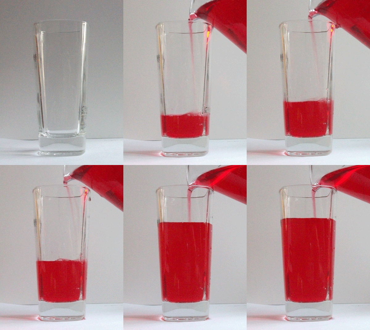
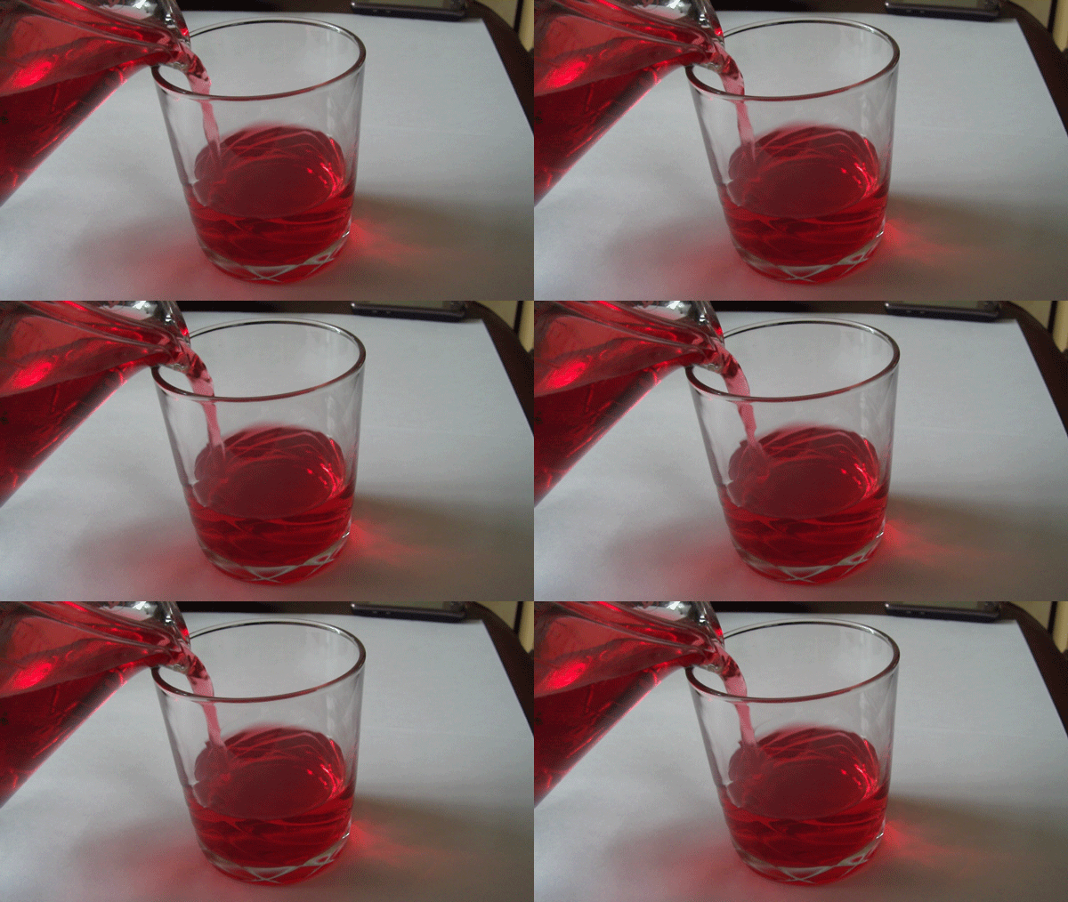
An animated gif is a type of GIF image that can be made to show movement by combining several images into a single GIF. There are two types of animated gifs, one being a combination of several photos and the other being a combination of a video and a still image.
Jamie Beck is a New York City based fashion photographer. He collaborated with Kevin Burg, a web designer with a background in video and motion graphics, to develop the art of animated GIFs. They began creating them during fashion week a year ago. Their first animated images were a series of still shots in a continuous loop. Then on they began to find new ways of creating a more fluid motion and isolating certain parts of an image to capture the moment. The process involves still and video photography. Taking a photograph captures the moment in a still time frame but with an addition of video it allows that magical moment to come to life. Cinemagraphs are a way of adding motion to a still image. For them a intricate ones would take about a day whereas a simpler one would take 3-4hours.
Geraldine Georges inspired experimentation
Geraldine Georges is a Belgium illustrator and graphic designer who uses a combination of illustration and photography. Her images consist of most commonly portraits adorned with shapes and objects such as flowers, bold black lines and areas. In some of her illustrations animals are included as either extras or to become part of the form.
Below is my hand made attempt of creating an image inspired by Geraldine Georges. I used different materials such as ink, pens and paper. I splatted and dotted the ink around the page then tipped it up and blew the ink so that the ink could spread. I cut around a photograph then cut into it, I wasn't paying particular attention to detail except for when cutting around the eye. As I had a limited amount of time to create this it was hard to make it quite creative so it had to be kept simple but still with comparisons to Geraldine Georges work.
Photoshop Experiments
I liked the hands on approach to creating a Geraldine Georges inspired piece as I could make it how I wanted it without any obstacles such as brushes. Photoshop however can lead to more creative ideas and colours. The brushes available can vary and for specific brushes they can be downloaded. After doing the two I now think that I prefer Photoshop as its more creative with brushes however it is very time consuming and harder to draw accurate shapes with a cursor. I resorted to using software called X-pen, it allows you to freely draw on a pad which is like drawing on paper which appears on screen.
Norm Magnusson 'decorating nature'
Norm Magnusson is a New York based artists known for his 'decorating nature'. He used the environment around him for the canvas of his work. He has made a series of work whereby he paints or colours different parts of nature. It varies from coloured stripes on leaves to circles on a stone to splashes of colour underwater. The meaning behind this series is to show and explore the complicated relationship between mankind and nature. We use nature how we see fit to, whether it being using it for profit, making it prettier, keeping it as it is or changing it for the 'better'. By decorating nature it makes people take a second look at what it is, some might interpret it is a new life to what is already there where as others may see it as destroying what is natural just to please others to appreciate nature.
Here are my own examples of 'decorating nature' -
Jan Van Holeben style photograph
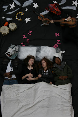
Jon Von Holeben was born in 1977 and brought up in Germany. From the age of 13 he followed in his fathers photographic career by picking up a camera and experimented with taking all sorts of photographs. His work shows the influence of his parents, a cinematographer and a child therapist. He wanted to create a visual representation of childhood , in his series of 'dreams of flying' he's taken many different scenes that would be of what children dream of. It was produced in 2002 with children from his local neighbourhood in southwest Germany.
Markus Kisson inspired pop-up photos
Markus Kisson is a digital artists based in Berlin. Looking at his works I am experimenting with creating my own Markus Kisson pop-up photographs. He would take a polaroid photograph then cut around parts of the photograph and bend it upwards so that they stick out.
Below is my quick example of a pop up photo -
First I decided what photograph I wanted to pop up, I decided to go with a photograph of a church that I had taken as my theme is architecture. I Then chose what photograph I wanted as the background, I thought choosing something simple like grass and sky.
1. I cut around the church
2. folded where the grass ended
3. followed a tutorial as to how to cut the background for pop up tabs
4. Glued the church onto the pop up tab
Lin Osborn style photographs
Looking at Lin Osborn's work I experimented with creating my own Lin Osborn inspired arranged photographs. This is an example of her work.
Using photoshop I followed a tutorial to create my own arranged photographs inspired by her.
1. New document - 210mm x 210mm.
2. Drag all images into photoshop > click crop tool >Hold shift and drag the crop tool to a square > ok
3. Do the same steps for all of the images.
4. Using the move tool drag the images into the blank document.
5. cmd apostrophe to get a grid up > view > snap to grid
6. Select each image layer > move to the edge of the grid lines > adjust the size
7. Repeat the previous steps for all images.
8. Hold shift and select all images move so it has an equal boarder.
Below are my own inspired arranged photographs. I chose a selection of photographs of different places but still within my theme of architecture. After arranging the photographs I applied a gradient to the photographs.
Below are my own inspired arranged photographs. I chose a selection of photographs of different places but still within my theme of architecture. After arranging the photographs I applied a gradient to the photographs.
Typography
To develop my skills and knowledge of Photoshop further I experimented with a technique called typography. It involves an original image being overlayed and formed by text. I like that you can choose the text you wish to overlay as it can be anything or relate to the text. As well as choosing what text to have you can vary the size of the font, by having the font large you are able to read it and it can tell a story about the image chosen.
1. Open image > Select > colour range - click Shadows and selection > ok > cmd C to copy > cmd V to paste.
2. Select original layer of image > select > colour range - click midtones and selection > okay > cmd C to copy > cmd V to paste.
3. Select both layers > cmd E > hide original image layer
4. Create a new document for your text 20cm x 20cm resolution 300 > ok
5. Select text tool > draw by holding click and dragging out > open document with text in > copy text > paste into text box in photoshop > font edwardian script font size 30 > deselect
6. Edit > define brush presets > ok
7. Click on image document > select brush tool > new layer > select brush size 300 ensure its black opacity 100 > paste onto photograph covering it all > increase size of brush, paste onto photograph until happy with it.
8. Click layer mask on text layer > hide layer > select layer 1 > cmd A to select all > cmd C to copy > show text layer > click on the layer mask (white square) > hold alt and click > cmd V to paste your selection > cmd D to deselect.
9. Cmd I to invert > hide layer 1 > create new layer > drag it down so its underneath text layer > fill white.
10. Select text layer > blending options > gradient box - blending mode on screen - choose gradient - edit scale and angle > ok.
11. Select black colour > click on brush tool > soft brush size 30 opacity 30 > paintbrush over certain layers to get rid of excess white
Photographs
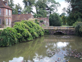
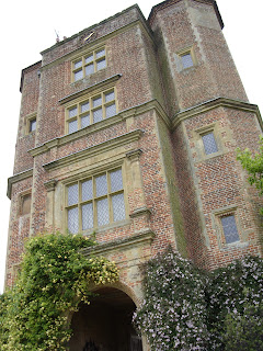
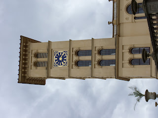
These are some photographs I have taken to do with my theme. They were taken at various different national trust and english heritage places.
5 Analysis
Ruins by George Laszlo Kovacsic
Black and White House by David Owens
Dark Architecture by Brian Auer
On the Other Side by Alain Etchepare
Subscribe to:
Comments (Atom)


