Thursday, 9 May 2013
Evaluation
The theme for the exam was Inside, Outside, In Between. I thought of different starting points that I could link to this such as inner character, 5 senses, the everyday, space and light and movement. I decided to follow the path of 5 senses. Within this there is a wide range of things to explore like the different 5 senses, body parts, surgery etc. Within the theme of 5 senses I thought of basing mine around different foods and the senses they apply to. Originally I wanted to link my photographs to all 5 senses by photographing specific things that relate to each sense but that would have made my ideas very broad. I changed my idea to only focusing on a few. I labelled my theme as foods. I wanted to capture photographs of the insides,outsides and in between of different food so that it would have a literal link to the theme.
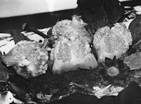
I looked at the work of Stephanie Gonot and Helen Chadwick which inspired me to experiment and look at using grotesque foods. Helen Chadwick uses grotesque foods such as raw meat and organs but makes them look nicer by combing them with fur, gold leaf and jewelry where as Stephanie Gonot uses sweet foods and changes them to make them look grotesque by mushing them and melting them. I took two films that were each inspired by the two photographers. For my first film I focused it on food that looked quite fleshy such as salmon, liver,minced meat and pomegranate. I tried to shape the liver and minced meat to look like organs such as lungs and the brain. My first film was mainly for experimentation of techniques rather than following a particular path. My second film was based on inspiration by Helen Chadwick, I photographed grotesque foods such as fish skin, strips of raw meat and raw meat. Before taking the photographs I arranged them on fabric and added elements such as sugar coated sweets and shiny tin foil to make the subject seem more appealing. One of my favourite photographs was of pepper storks placed on a pile of tea leaves with cabbage leaves. I liked this composition because the way I had arranged it made it look like flowers in a flower bed which takes away from the fact that they were foods that had started to go off and decompose. My third film was inspired by Stephanie Gonot as I photographed sweet foods such as melt in the middle chocolate cake and jelly and ice cream but included the chocolate oozing out and the ice cream melting over the jelly to make them seem less appealing.
I looked at the work of Stephanie Gonot and Helen Chadwick which inspired me to experiment and look at using grotesque foods. Helen Chadwick uses grotesque foods such as raw meat and organs but makes them look nicer by combing them with fur, gold leaf and jewelry where as Stephanie Gonot uses sweet foods and changes them to make them look grotesque by mushing them and melting them. I took two films that were each inspired by the two photographers. For my first film I focused it on food that looked quite fleshy such as salmon, liver,minced meat and pomegranate. I tried to shape the liver and minced meat to look like organs such as lungs and the brain. My first film was mainly for experimentation of techniques rather than following a particular path. My second film was based on inspiration by Helen Chadwick, I photographed grotesque foods such as fish skin, strips of raw meat and raw meat. Before taking the photographs I arranged them on fabric and added elements such as sugar coated sweets and shiny tin foil to make the subject seem more appealing. One of my favourite photographs was of pepper storks placed on a pile of tea leaves with cabbage leaves. I liked this composition because the way I had arranged it made it look like flowers in a flower bed which takes away from the fact that they were foods that had started to go off and decompose. My third film was inspired by Stephanie Gonot as I photographed sweet foods such as melt in the middle chocolate cake and jelly and ice cream but included the chocolate oozing out and the ice cream melting over the jelly to make them seem less appealing.
One thing that has always interested me is Cinemagraphs by Jamie Beck. I created my own animated GIFs then went onto creating Cinemagraphs. Jamie Beck founded cinemagraphs in 2009 and since then they have grown in population and branched off on many different ideas. Beck's Cinemagraphs have a unique feel about them as they were the first to be heard of. His work inspired me to experiment with this for my final piece. I tested out different cinemagraphs from foam coming out of an apple to water filling up a glass. I wanted my final piece to be a combination of different foods and drinks that would be consumed in everyday life.
I've experimented with a wide range of experiments and techniques. Handmade negatives, solarisation, reversals, combination prints, post production, tinting prints, liquid emulsion, sandwich prints, masking, selective development and collage. I experimented with handmade negatives to make it look like microscopic images. As my theme is food I wanted to in keep with it so I found some rice, golden syrup, oats, flour and other different foods. These resulting in really good microscopic looking images. Solarisation is a really easy technique that results in good outcomes. Handmade negatives, solarisation and reversals are quite simple techniques so I wanted to try something a bit more challenging. I tried combination printing by using the photos I took of body parts and experimented with exposing the photos I had taken of liver and minced meat into the parts of the body. I was unsure how it was going to work but I just went ahead and tried different attempts. I was really pleased with the outcome as it looks like you can see through the skin to the muscle. I had never used liquid emulsion before and have always wanted to experiment with it. I wanted something original other than using different types of paper. I thought why not print food on foods. I tried printing on different types of food but it was hard to work out what setting they needed to be on. Another technique that I had never used before was anthotypes and cyanotypes. These were really creating and you never really know what your outcome is going to look like. My cyanotypes worked better than my anthotypes but it was still fun to see what interesting results I could get from them. The animated GIF and the cinemagraphs were a completely new route to take but I thought it was a good way to take my work as they are quite challenging and they take a lot of time and patients to get right. I tried different foods to see what worked well and what didn't. After this I thought that simple plain well lit compositions worked best as the focus was on the object in the composition.
Overall I found the exam theme quite difficult to start with as it was hard to think of a starting point. Even though there was so many different ways into the theme once I decided what I wanted to do it was hard to come up with loads of different ideas that I could explore. As the project went on I found what I wanted to do and my imagination grew to help me with my photographs and experiments. I enjoyed working on my preperation work because I discovered new ways to develop my original photographs using a wide range of artistic mediums, technique and sources. I think I will be very pleased with my final outcome when it is complete because I have always had an interest in cinemagraphs and it is something different to what I have previously done in the exam and in coursework. I think my outcome will be present well and have good supporting work.
Tuesday, 7 May 2013
Jamie Beck
A cinemagraph is an image that contains within itself a living moment that allows a glimpse of time to be experienced and preserved endlessly. Visual artist Kevin Burg began experimenting with the gif format in 2009 but it wasn't until he partnered with photographer Jamie Beck to cover NYFW that cinemagraphs were born. Starting in camera with a still photograph it is then combined with a living moment into the image through the isolated animation of multiple frames. Beck and Burg named the process ' Cinemagraph' for their cinematic quality while maintaining the principal of a traditional photograph. From the release of cinemagraphs by Beck and Burg cinemagraphs have become well known and people have made new and different cinemagraphs from food to train stations.
At first the viewer assumes that it is just a photograph until further inspection where you notice a moving part of the image. When I first looked at the work of Jamie Beck I was confused and fascinated. This was at the time when I had never seen a cinemagraph and didn't really know about animated GIFs. The first word that came into my head was wow, because his style of work is really unique and was the first person to create cinemagraphs. His work gives off a really good effect and it actually looks like the whole image is still until you notice the moving parts. There is no sound to the image so it makes it harder to work out what is moving and what isn't.
I like that in all of his first cinemagraphs it mainly all had women in as it was to do with the New York Fashion Week. This gave it a connecting link between each cinemagraph and sowed the connection to media and what was happening at the time. Each one tells a story in a different way, maybe the scenes are linked to each individual woman.
The colours that have been used is normal colours instead of black and white or sepia. This adds to it being a moving moment. The colours make the images pop as you feel like you are there in the photograph experiencing it.Some of the cinemagraphs have been edited by having a soft retro effect applied to them to give them a more cinemagraphic look about them with a grainy film appearance.Beck probably used professional technology and programs to produce his cinemagraphs but the same effect can be easily created in Photoshop by following a step by step guide. The key to a cinemagraph is to keep the camera in a very still position so that it is easy to manipulate the part to keep moving.
Monday, 6 May 2013
Exam Ideas
Tuesday, 23 April 2013
Cinemagraphs
I made more cinema graphs too see what other outcomes I could achieve. Cinemagraphs are usually a constant loop of animation over a photograph to make it look continuous. I experimented with cinema graphs being continuous and stop starting. The first videos I experimented with was making a apple foam. I cored an apple and lined it with cling film. Added a teaspoon of bicarbonate of soda then adding the vinegar quickly. I also added blue food colouring to the vinegar to add some colour. In the 1st animation it looks like the apple is foaming, in the 2nd one only one bubble moves, in the 3rd one the liquid is continuously flowing down the side of the apple, the 4th one sauce is boiling in one place, and the 5th water is filling a glass but the level is not rising. My favourite cinemagraph is the water filling in the glass. I like this one as you can see the bubbles in the water and the water pouring into the glass but the water level isn't rising. For my final piece I want to develop this further by having a plain black or white background and well lit subject matter with a high quality feel. 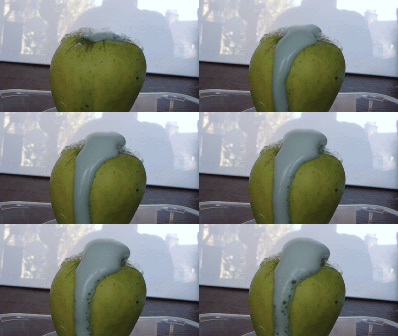

Cyanotypes
Cyanotypes use a solution of iron compounds. The photograph can be taken with a camera and the resulting photo turned into a negative that can be used to make a cyanotype. The cyanotype is made up of two solutions, potassium ferricyanide and Ferric ammonium citrate are mixed with water separately. The two solutions are then blended together in equal parts. Paper,card,textiles or any other naturally absorbent material is coated with the solution and dried in the dark. objects or negatives are placed on the material to make a print. The cyanotype is printed using UV light such as the sun or a UV lamp. after exposure the material is processed by simply rinsing it in water. A white print emerges on a blue background and the final print is dried.
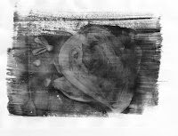
I opened my images in Photoshop changed it to black and white, increased the contrast and inverted it. I printed it onto tracing paper. I set up my board in the sun, put the paper down quickly and put my images on top then placed a piece of glass on top to keep the paper down. I timed it for about 8 minutes then put the paper in a black bag so that it would stop developing. I then took it into the darkroom and ran it under cold water. The image started to appear and the paper became blue. I left it in the dark to dry. I was pleased with my outcome as you can see what the images is clearly but to improve it I could have used an image that was more black and white. My image had quite a grey background so the print was quite dark instead of having defined dark and light parts.
I opened my images in Photoshop changed it to black and white, increased the contrast and inverted it. I printed it onto tracing paper. I set up my board in the sun, put the paper down quickly and put my images on top then placed a piece of glass on top to keep the paper down. I timed it for about 8 minutes then put the paper in a black bag so that it would stop developing. I then took it into the darkroom and ran it under cold water. The image started to appear and the paper became blue. I left it in the dark to dry. I was pleased with my outcome as you can see what the images is clearly but to improve it I could have used an image that was more black and white. My image had quite a grey background so the print was quite dark instead of having defined dark and light parts.
Tuesday, 9 April 2013
Cinemagraphs
A cinemagraph is different to an animated gif as not all of the image moves, you can select parts to keep still. I wanted to develop my skills further so I tried to make a cinemagraph. I did this in Photoshop by following a tutorial.
1. capture a video of the set up where something is moving.
2. Open Photoshop. Press ctrl O to open a file, open the video file that you are using for your cinemagraph.
3. If the animation box does not pop up straight away then go to windows - animation.
4. Click on the fly out menu ( arrow with 3 lines next to it) and click document settings. Change the Frame rate to 15fps.
5. move the first time line indicator to where you want your video to start from. move your mouse to over the Work area start point, click and hold and hold down shift and drag it to the time line indicator that you just moved. The Work area start point should snap to the line.
6. Capture about 12 frames of the video for the animation. move to the bottom of the animation box and select next frame, click this 12 times.
7. Click and hold the work area end point, hold down shift and drag it to where the time line indicator is now at. Press play to view the frames inside of the selected region.
8. Go to the fly out menu, click trim document duration to work area.
9. Use the time line indicator to find a frame that you want to capturre as the still photograph.
10. Go to select - All. Go to Edit - Copy Merged. Go to Edit - Paste.
11. Press the Q key, or go to the icon with the white circle in the square underneath the colour box. Select the paintbrush tool and select the colour black. Choose the size of the brush depending on your image and with a hardness of 68%.
12. On your image, paint over the areas of the image that you do not want to move.
13. Select the Q key or to icon underneath the colour box. This makes a quick selection.
14. In the layers panel, hide the video layer by clicking they eye next to layer 1. Have the frozen layer selected (layer 2.)
15. Hold the Alt key and click the layer mask button at the bottom of they layer panel.
16. Turn on the visibility of the video layer by clicking the eye next to layer 1.
17. In the animation box, click play to view the animation.
18. Go to the fly out menu once again, click flatten frames into layers. Each frame is now in a layer. throw away the original layers, select the layer with the mask (layer 2, and layer 1), drag them to the trash can icon.
19. Select the lowest frame (frame 0). Right at the base of the right hand side of the animation box is an icon with 3 squares in it, click on this.
20. Go to the fly out menu, click make frames from layers. Click the play button to view the series of frames.
21. On the first frame Click on the time selector at the bottom left hand corner of the animation box and select no delay.
22. Click on the repetition selector, choose 'forever'. Press play to view the animation.
23. To export it as an animated gif, go to file - save for web and devices.
24. adjust the file size down for example 600w. in the presets select GIF, selective, dither the image with pattern, select the highest colours, click on covert to sRGB. Save.
The first cinemagraph that I experimented with was whisking egg whites. I filmed them foaming up in 10 second videos. I thought that I would be able to combine all the videos into one so that you can see more of a change but this would have made it too long and harder to select the still. I took a photograph of the whisks as a still and put this in front of the video. My intention was to use the photograph of the whisks on top of the video so that it looked like the whisks were still and the egg whites were being whisked. I did achieve this but because I only selected the whisks and not the whole image I couldn't stop the whisks in the video from spinning. In my cinemagraph above you can slightly see the whisks spinning in the background if you look closely. I experimented in different ways to keep them still but I couldn't find out how to.
My second cinemagraph that I made was water dripping down an apple. I set up my camera on a tripod and set the apple on a stand. I tried dipping it in water and videoed the drips but they dripped really fast resulting in a couple of seconds video. I soaked a sponge in water and squeezed it above the apple so that there was continuous drips down the apple. I took a still shot from the video at a point where drips were half way down the apple and made sure that these drips did not move in the video. This cinemagraph worked much better as you don't realise at first that the drips are still throughout the cinemagraph while the other drips continue down the apple.
Animated Gif
An animated GIF is a file where a series of photographs are made into a short animation. I followed a tutorial to make this animated GIF.
1. First you need a sequence of pictures. Each of the photos should be in separate layers. The easy way to do this is go to File - Scripts - Load Files into Stacks.2. Select Windows - Animation. You'll see your first image selected on the bottom left in the animation box that pops up. Click on the small tab at the bottom of the animation box that says 'duplicate this layer'. Now add the second photo, you want in your animation by hiding the first image/layer. The second image should be in view. Continuing adding boxes and selecting each consecutive photo, one at a time, until they're all in order in the animation screen at the bottom.
3. Shift-click all the boxes so they're all selected in the animation box. Click on the time selector at the bottom left. Here you can change how much time you want in between each photo.
4. Click on the repetition selector line under that. I kept it on 'forever'. Click the 'play' button to the right of the forever box to preview the animation box. You can delete frames after viewing the preview by clicking on the trash can icon next to the 'duplicate frame' button.
5. Go to File - Save for Web and Devices. Adjust the size before saving as a gif. Make sure the dither is up 100% and the colours are at their highest,256, before saving it.
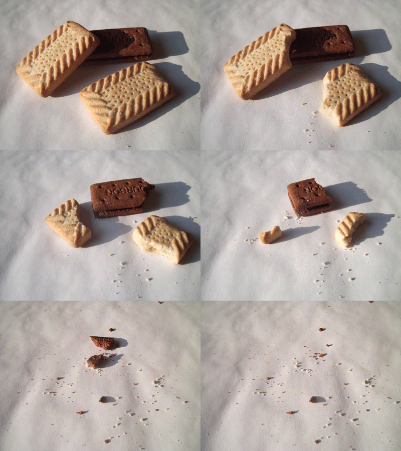
I like the way my animated GIF came out because the biscuits are being eaten without video of anyone eating them. I tired to keep the camera in the same place by putting it on a tripod so that there wasn't much movement when taking the photographs. I set the speed of each photograph to be at 0.075 seconds so that it wasn't too slow but wasn't too fast you couldn't see it at each stage. I found it easy to make an animated GIF as it is simple to set up and shoot each stage and making it into a GIF is easy to follow the instructions for Photoshop. I could improve this GIF by making sure that each photograph is taken in the same position so that the only movement is of the biscuit being eaten. I would like to do it again and maybe editing the colour and contrast.
Flame Tutorial
I wanted to find a tutorial that would with my image of the ice cream and the jelly. I thought of editing it to look like fire as this could symbolise the ice cream melting. I searched on Youtube for a tutorial. I followed one of the tutorials but The way they did it they inversed the image which didn't look right with my image. I changed and missed out some of the steps and produced this image below. I like the way the fire links with the burning ice cream but I don't think the tutorial is very technical that changes the image into something better or enhances it.
1. Open image in Photoshop and cut out the subject matter from the background. Paste into a new layer.
2. Desaturate the image. Adjust the levels, increase the whites, decrease the mid tones and the black.
3. Invert the image.
4. Go into the channels pannel, whilst holding Ctrl click the RGB thumbnail. Ctrl + C.
5. Create a New document. Fill the background black.
6. Paste the image into the document. Resize the image whilst holding Shift. Lock the layer.
7. Select a brush tool, paint over the image in light yellow. Unlock the layer.
8. Double click the layer, select outer glow, change the colour to red and change the opacity to 50%.
9. Lock the layer. Select the brush tool and paint around the edges of the image in an orange colour to enhance it.
10. Open an image of fire in Photoshop. Go to the channels panel. Select the green layer and click the small circle icon at the bottom. Select the RGB layer then go back to layers. Copy this layer and paste it onto the document with you image. Resize the fire and paste it around the edges of the image until you are happy.
11. Select the Erase tool with a soft brush and erase areas of fire that are over the image that you done want.
Sliced Fruit Effect
I came across this effect while I was searching for digital experiments. I thought it was quite interesting and wanted to create my own. I found a tutorial to follow on Youtube.
1. Take a photograph of the backdrop. Slice fruit, in my case I used an apple. Slide the slices onto a kebab skewer. Take a photograph of the fruit in the same place of the photograph of the backdrop.
2. Open both images in Photoshop.Overlay the apple image on top of the background. Decrease the opacity of the fruit layer and line up the photograph with the other layer, This may be by rotating it or re-sizing it.
3. Increase the opacity too 100% and using the rubber tool, rub away the skewer so that it is not visible. Some areas may need to be touched up a bit.
4. Save the file.
This was a really easy tutorial to follow and each step was simple without any complicated aspects that I didn't know how to do. I could improve this experiment by using a more complicated composition with more things in the photograph. I would like to do it again but putting my improvements into practice.Dispersion Effect
I found a tutorial on Youtube for editing photographs to give it a dispersion effect. I thought this would work well with my photographs and fit in with my theme of 5 senses/food and inside, outside, in between as it makes it look like the insides of the food are spilling out.
1.Open image in Photoshop.
2. Select the subject in the picture, copy into a new layer. Hide background layer.
3. Create a new layer and paste again, slightly off set it and adjust the brightness darker and contrast higher.
4. Create a new layer and paste again, stretch the image to the edge of the document.
5. Reorder them so that the original layer is at the top and the stretched image is at the bottom. Select the stretched layer and add a layer mask. Fill the layer mask black. Change the brush tool to a splatter brush, change the colour to white. Click with the different splatter brushes where the image would be.
6. Select the off set layer. Add a layer mask. Fill the layer mask black. Change the brush tool to a splatter brush, change the colour to white. Click with the different splatter brushes where the image would be.
7.Select the original image. Add a layer mask. Fill it white. Change the brush tool to a splatter brush, change the colour to black. Click with the different splatter brushes around the edge that connects to the other splatter marks.
8. (optional) Add a gradient background of its main colours and add a lens flare.
1.Open image in Photoshop.
2. Select the subject in the picture, copy into a new layer. Hide background layer.
3. Create a new layer and paste again, slightly off set it and adjust the brightness darker and contrast higher.
4. Create a new layer and paste again, stretch the image to the edge of the document.
5. Reorder them so that the original layer is at the top and the stretched image is at the bottom. Select the stretched layer and add a layer mask. Fill the layer mask black. Change the brush tool to a splatter brush, change the colour to white. Click with the different splatter brushes where the image would be.
6. Select the off set layer. Add a layer mask. Fill the layer mask black. Change the brush tool to a splatter brush, change the colour to white. Click with the different splatter brushes where the image would be.
8. (optional) Add a gradient background of its main colours and add a lens flare.
The cake didn't work that well as you can see the chocolate cake beneath the custard and there is an edge to the splatter marks where the cake finishes in the other layers. To improve this I would make sure that the cakes were in line and the the colours follow on from one another.
I took my comments from the first one I did forward into my second one. I made sure that the dispersion went all the way to the edge and that the colours followed on. In some areas there may be a small amount of colours where they shouldn't be but I don't think its that noticeable.
The jelly is my favourite edit as it is the more realistic one of the three. I like the way the disperse is spreading and the colours. The fact that it is all one colour, red, it makes it look like blood splatter which adds to the gruesomeness.
Wednesday, 3 April 2013
Review
The theme for the exam was Inside, Outside, In Between. I thought of different starting points that I could link to this such as inner character, 5 senses, the everyday, space and light and movement. I decided to follow the path of 5 senses. Within this there is a wide range of things to explore like the different 5 senses, body parts, surgery etc. Within the theme of 5 senses I thought of basing mine around different foods and the senses they apply to. Originally I wanted to link my photographs to all 5 senses by photographing specific things that relate to each sense but that would have made my ideas very broad. I changed my idea to only focusing on a few. I labelled my theme as foods.
I looked at the work of Stephanie Gonot and Helen Chadwick who both work with food/meat.I liked the way they both made their photographs grotesque. Helen Chadwick photographed raw meat and organs combined with materials such as gold leaf and fabric to make the meat seem less gruesome, where as Stephanie Gonot photographed sweet food such as ice cream and jelly then manipulating it by mushing up the jelly and making the ice cream run down the hand to make them seem less appealing.
Both take the same route in ideas but explore it in different ways. I applied this to my work. For my first film I focused it on food that looked quite fleshy such as salmon, liver,minced meat and pomegranate. I tried to shape the liver and minced meat to look like organs such as lungs and the brain. My first film was mainly for experimentation of techniques rather than following a particular path. My second film was based on inspiration by Helen Chadwick, I photographed grotesque foods such as fish skin, strips of raw meat and raw meat. Before taking the photographs I arranged them on fabric and added elements such as sugar coated sweets and shiny tin foil to make the subject seem more appealing. One of my favourite photographs was of pepper storks placed on a pile of tea leaves with cabbage leaves. I liked this composition because the way I had arranged it made it look like flowers in a flower bed which takes away from the fact that they were foods that had started to go off and decompose. My third film was inspired by Stephanie Gonot as I photographed sweet foods such as melt in the middle chocolate cake and jelly and ice cream but included the chocolate oozing out and the ice cream melting over the jelly to make them seem less appealing.
I've experimented with a wide range of experiments and techniques. Handmade negatives, solarisation, reversals, combination prints, post production, tinting prints, liquid emulsion, sandwich prints, masking, selective development and collage. I experimented with handmade negatives to make it look like microscopic images. I have only ever used materials such as washing up liquid, salt and food colouring for handmade negatives but the use of materials is limitless. As long as it can fit in the negative carrier it can be used. As my theme is food I wanted to in keep with it so I found some rice, golden syrup, oats, flour and other different foods. These resulting in really good microscopic looking images. Solarisation is a really easy technique that results in good outcomes. I never know what the right way to solarise is, whether it should be more grey or more black, but I don't think there is really a right or wrong way to solarise. Handmade negatives, solarisation and reversals are quite simple techniques so I wanted to try something a bit more challenging. I tried combination printing by using the photos I took of body parts and experimented with exposing the photos I had taken of liver and minced meat into the parts of the body. I was unsure how it was going to work but I just went ahead and tried different attempts. First I exposed the body part to the paper and remembered where I wanted to expose the negative of the meat. I used my hands to cover the areas of the paper I didn't want to expose on to. This didn't quite work as areas overlapped. I tried again by cutting out a oval shape out of black card and using this instead of using my hand. This worked and I was really pleased with the outcome as it looks like you can see through the skin to the muscle. I had never used liquid emulsion before and have always wanted to experiment with it. I wanted something original other than using different types of paper. I thought why not print food on foods. I tried printing on different types of food but it was hard to work out what setting they needed to be on. This is something that I want to experiment with again.
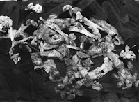
The experiments I want to take further is the liquid emulsion and some post production experiments. I haven't really explored many post production experiments yet and after doing so I think I will have a clearly ideas as to what I want to do for a final outcome. During the two weeks before the exam I want to try and explore as many different experiments in the darkroom and post production. I also want to explore some digital experiments as I don't have that many. However I prefer darkroom and think that there is a much wider range of experiments that I can do in the darkroom with my theme. I want to experiment with cinemagraphs as I think they are really interesting and can trick the mind which may be a way to explore for a final piece. I want to achieve a final piece that reflects on all of the work I have done so far to showcase the variety and limitations of experiments and materials.
Both take the same route in ideas but explore it in different ways. I applied this to my work. For my first film I focused it on food that looked quite fleshy such as salmon, liver,minced meat and pomegranate. I tried to shape the liver and minced meat to look like organs such as lungs and the brain. My first film was mainly for experimentation of techniques rather than following a particular path. My second film was based on inspiration by Helen Chadwick, I photographed grotesque foods such as fish skin, strips of raw meat and raw meat. Before taking the photographs I arranged them on fabric and added elements such as sugar coated sweets and shiny tin foil to make the subject seem more appealing. One of my favourite photographs was of pepper storks placed on a pile of tea leaves with cabbage leaves. I liked this composition because the way I had arranged it made it look like flowers in a flower bed which takes away from the fact that they were foods that had started to go off and decompose. My third film was inspired by Stephanie Gonot as I photographed sweet foods such as melt in the middle chocolate cake and jelly and ice cream but included the chocolate oozing out and the ice cream melting over the jelly to make them seem less appealing.

I've experimented with a wide range of experiments and techniques. Handmade negatives, solarisation, reversals, combination prints, post production, tinting prints, liquid emulsion, sandwich prints, masking, selective development and collage. I experimented with handmade negatives to make it look like microscopic images. I have only ever used materials such as washing up liquid, salt and food colouring for handmade negatives but the use of materials is limitless. As long as it can fit in the negative carrier it can be used. As my theme is food I wanted to in keep with it so I found some rice, golden syrup, oats, flour and other different foods. These resulting in really good microscopic looking images. Solarisation is a really easy technique that results in good outcomes. I never know what the right way to solarise is, whether it should be more grey or more black, but I don't think there is really a right or wrong way to solarise. Handmade negatives, solarisation and reversals are quite simple techniques so I wanted to try something a bit more challenging. I tried combination printing by using the photos I took of body parts and experimented with exposing the photos I had taken of liver and minced meat into the parts of the body. I was unsure how it was going to work but I just went ahead and tried different attempts. First I exposed the body part to the paper and remembered where I wanted to expose the negative of the meat. I used my hands to cover the areas of the paper I didn't want to expose on to. This didn't quite work as areas overlapped. I tried again by cutting out a oval shape out of black card and using this instead of using my hand. This worked and I was really pleased with the outcome as it looks like you can see through the skin to the muscle. I had never used liquid emulsion before and have always wanted to experiment with it. I wanted something original other than using different types of paper. I thought why not print food on foods. I tried printing on different types of food but it was hard to work out what setting they needed to be on. This is something that I want to experiment with again.


The experiments I want to take further is the liquid emulsion and some post production experiments. I haven't really explored many post production experiments yet and after doing so I think I will have a clearly ideas as to what I want to do for a final outcome. During the two weeks before the exam I want to try and explore as many different experiments in the darkroom and post production. I also want to explore some digital experiments as I don't have that many. However I prefer darkroom and think that there is a much wider range of experiments that I can do in the darkroom with my theme. I want to experiment with cinemagraphs as I think they are really interesting and can trick the mind which may be a way to explore for a final piece. I want to achieve a final piece that reflects on all of the work I have done so far to showcase the variety and limitations of experiments and materials.
Subscribe to:
Comments (Atom)


