Thursday, 24 January 2013

Evaluation


The title of the brief was 'Personal Project' . I was required to go above and beyond the techniques and experiments I already knew to find and do a wider range of experiments that I have never tried before. It gave me the opportunity to show my technical abilities through a range of digital and darkroom experimentation. At the end of the project I would have a sketchbook showing a working progress, mounted sheets of my best work, and a final outcome. The theme that I chose to run through both coursework projects was architecture.

This project developed quickly for me as I enjoyed working with my chosen theme. Firstly I explored a range of different artists and photographers that I liked the work of. This lead me to in-depth analysis of a selection of artists who's work had inspired me the most. I created my own experiments based on their work. I used digital and film photographs to experiment with through Photoshop and in the darkroom. I had revisited previous experiments from that last projects that I had liked as I thought they would work well with my chosen theme. Using my imagination I combined these different experiments and techniques to come up with new imaginative ideas. Using both my own ideas and the inspiration from the works of other artists it helped me improve and enhance my images.


The first film that I took was of buildings in and around my area, when I was taking the photographs I had ideas in my head of ways that I could experiment with them. For example I wanted to experiment with taking photographs of windows,doors, sides of buildings to put together to make one building. When I was shooting my film I considered which parts of a building I would need to take for this to work. However as I only allowed 4 photographs per experiment this did not leave me with enough photographs for this idea to work fully. I did not take this idea any further than just an idea but hopefully in future projects I might be able to experiment with this idea. 

 
 At the beginning of the project I looked at the work of Mike Hewson, Johan Thornqvist, and Matthew Cox. These artists inspired me to experiment with new techniques that I had not tried before. Matthew Cox is known for sewing into x-rays which gave me the idea to sew into some of my photographs to highlight certain areas.  Johan Thornqvist inspired me to draw on top of my photographs. When I came across Mike Hewson's work I was really surprised by it and loved the way it was presented. He paints an image onto fabric then attaches it to buildings that are to be demolished, it shows what the buildings used to be and the characteristics of it and how it brought the community together. I really liked this idea and wanted to explore doing this myself. I thought of places that I would be able to get exterior and interior shots of a buildings to merge together. My favourite combination that I did was of a church, from the side of the building it gave the illusion of the wall being knocked in to expose the interior. 

The photographer that inspired me for my final outcome was Chris Seddon. He photographed a project called 'mapping Nottinghamshire'. It involved people from the local area to go out and take photographs on their phone or camera then to go to Rufford Gallery to print out the photograph onto a luggage label then pin it onto a map of Nottinghamshire where the photograph was taken. I really liked this idea as it is an original way of presenting photographs that I had never considered before. I thought it worked really well with my chosen theme of architecture. 

Experiments such as the handmade negatives and staining my photographs I think worked particularly well. To create the handmade negatives I got a small piece of clear plastic then I applied salt, washing up liquid and food dye. I then placed this in the negative carrier. This created a really cool effect which I thought would look amazing if I could apply it on top of my photographs. I experimented with different ways of combining a print with the handmade negative. I found that the best way was to expose the handmade negative to the paper then taking away that exposure time from the expose time I would use for the print, I then exposed the print onto the same piece of paper then developed it. This worked really well and had a great outcome, the image looked as if it had been destroyed. I took this even further by applying a wash of coffee to the print to give it an aged look as I the photographs were of old buildings it would in-keep with the idea of being old and aged. I took this forward into my final piece and pinned these experiments onto the map. 


I am really pleased with my outcome as my ideas developed from a simple idea to a complex one. My final idea involved me printing in the darkroom a variation of different sized images onto photographic paper. I then scanned these onto different types of paper and stained some with coffee to give them an aged effect. I pinned them to the map using a variation of different pins and string. I think this added to the authenticity of it and gave it an overall quirky look. I decided not to use luggage labels for my final outcome as I think they worked better on a map with less photographs as it did not become confusing and over worked.
I think I could have improved on the final outcome by using a wider range of photographs. As I had only shot two films it didn't give me many photographs to work with as not every photograph came out well. In my final outcome on the back of some of the photographs I stamped the time that I took the photographs. I think I could improve on this by being more adventurous with this idea by maybe stamping the street name or a bit of information about the place the photograph was taken.  


Overall I've found the project interesting as I could take my own journey and explore more with what I wanted to do. I really enjoyed trying old and new techniques in both the darkroom and digitally, I now know what ones work and which ones don't. I hope to take forward some of my ideas such as the Mike Hewson inspired photographs and the handmade negatives. I think this project has given me the space to explore what I wanted to and to take what direction I wished to with only a slight bit of guidance. It has helped me to experiment with different techniques and look at a wider range of artists that have inspired me and will inspire me for the future. 

Final Outcome

Before I came up with my final piece I experimented with following through some of my original ideas of a final piece. One of my ideas was to do a mounted sheet of prints, to take this further I thought of presenting them on a light box. I photocopied my prints onto tracing paper and placed them on a light box, this made the black and white stand out really well, however you cannot see it in the image that clearly. This is an idea that I might consider when presenting my work in an exhibition as well as my final idea so that people can see the range of ideas that I came up with for presenting my work. 

Following on from this it lead me to my second idea which was pinned specimens. This idea came from looking at cabinets of bugs that have been pinned down with a description underneath. I carefully lined all of the images up then pinned them with dress making pins. Underneath the images I used a label maker to type the times I took the photographs. 

I then thought about keeping with the pinning idea but instead of pinning to a white background I thought about pinning them to a map of where the images were taken. As it is an old map I wanted to keep my images the same so I stained some with coffee to give it an old effect and to others I attached them to luggage tags. I really like this idea as it is more creative and link really well with my work. 

Below is what my final outcome is, it is a combination of all of the above experiments but adding more images varying in size and colour. I used different types and coloured string to attach the images to the map so that it gives it more colour and makes it more creative. On the back of some of the images I kept with my idea of printing the time, I used rubber stamps to stamp the times I took the photographs on the back. 


Chris Seddon Inspiration


Mapping Nottinghamshire is a Derby QUAD Participatory Photography project. It inspires people through camera and phone photography to explore Nottinghamshire. The photographic installation is in the Rufford Gallery, it changes and grows as photographs are added to the map day by day. 
In March 2012 Chris Seddon photographed the project for the council. Chris Seddon is a Derby music and events photographer who is assigned to photograph events such as this. Seddon took some of his own photographs in Rufford Park and pinned them to the map. 
I really like this idea because it allows you and others to view what is around the area that they may have not noticed before. The use of luggage labels symbolises the journey through tracking Nottinghamshire.
This inspired me to experiment with doing a similar idea for my final piece. As my photographs were taken in and around Croydon   I have found a map of Croydon and the surrounding areas. On the map I will find a variation of different pins to pin the photographs on with. I will experiment with using luggage labels to pin my photographs onto the map with. By using luggage labels it will give it more of an aged effect as well as the map being an original map that is slightly discoloured.

Ideas of Final Outcome


Monday, 14 January 2013

Handmade Aging Negatives

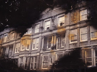
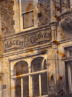
I experimented with combining handmade negatives over photograph with staining them with tea and coffee. On some prints I made the handmade negative out of focus which I think worked better than the focused handmade negatives on some because it looked like they had been burnt or destroyed. I want to take this further into my final outcome.


Aging Effect

As my pictures are of old ornate building around Croydon, I wanted to make them look aged. I wanted to give it a sepia look and a way that i've always known to do this is by using tea or coffee. I didn't know whether it would work on photographs or not but I gave it a go and was really pleased with the outcome. I mixed up some coffee and water, and had a tea bag in some warm water too. I painted on the tea and coffee using a paint brush. This process didn't take long and it dried well compared to using food colouring which leaves prints sticky. A sprinkled on some coffee granules to give it more of a stained look in some areas. I also scanned in my prints and tried painting on the coffee onto the printer paper to see if it gave it a different effect, it lightened the look of it and gave it more of a newspaper look. I also tried ripping around the image.


Vignetting

In the darkroom I experimented with creating a vignette around my images. Firstly I folded an A4 piece of black paper in half then cut out a fairly small semi-circle in the middle of the folded side of paper. Once opened out the paper had a circle cut out in the center, this is what I used to create the vignetting effect. In the darkroom I set my my enlarger with my desired negative in the negative carrier. I held the black paper a couple of inches above the photographic paper and exposed my image for 12 seconds. I moved the black card round in small circles so that the edges would become faded.

To create the black vignetting I exposed my image for the correct time then held a cut out circle above my paper and moved it in a circular motion whilst exposing for an extra 7.5 seconds.


Progress Review

During this project I have experimented with a range of different materials and techniques. One of the first experiments I tried was distorting the image by bending the paper when exposing the image. It took a few attempts to get it to work as I had to work out which part I wanted in focus. I tried bending the paper in both ways in an arch and in a U shape. I think this worked as seeing what the experiment looked like to actually see that it does distort the image but I don't think it works particularly well as being a technically good experiment.
Other experiments that I tried was putting water, washing up liquid, stop and fix onto the photographic paper before exposing the image then making a print as normal. When using the washing up liquid I washed it off before putting it into the develop in case it changed the and ruined the use of develop. I think it created a weird effect on the image but would work better with different subject matter. 
One if my favourite experiments I tried was handmade negatives. I created a handmade negative using salt, washing up liquid and food colouring. I really like how the ones with food colouring and salt looked as the image did not show through the food colouring which made the image look like it had been destroyed by fire. This links well with architecture thinking think building can be ruined by fire which can be expressed through the handmade negatives. 

Digital experiments That I have tried are blueprints, retro analog effect, handmade negatives and selective development. My favourite digital experiment was the blueprints as they connect so well to architecture and the look of some of them look quite professional. It was an easy tutorial I found to follow and had a great outcome. I chose from a range if different buildings that I had taken to see what effect they give. I tried with buildings with detail and ones with less detail. I think the buildings less detail work better because theres not much that can distract you away form the main detail. 
Selective development and handmade negatives used the same tutorial with a few slightly different steps. It was an easy tutorial to try a digital experiment, it shows what I wanted to achieve but I don't think it is that technically challenging compared to others. 
The retro analog effect took me a while to understand it and to get the effect I wanted as the ratio of colours and numbers are different from the tutorial I was following to my image. It was hard to find the right image that worked well with the effect because the colours in the original image have a great impact on what the image will look like as an end result. I chose images with a central focus point without much detail everywhere else. This worked better than having a busy photograph as where the colour leaks in it doesn't draw the attention to it. 

I have researched a range of different photographers which have influenced my work. these have been recorded on my pinterest board and on my blog. The three main photographers and artists that have inspired me are Matthew Cox, Mike Hewson, and Johan Thornqvist

My theme for the personal project is architecture, I chose to focus on old buildings which has been continued throughout my project as I have not included any modern buildings such as big glass architectural buildings. I have experimented with a range of ideas such as the variety of experiments that I have tried change the way the photograph can be viewed. The hand made negatives and the vignetting give the photographs as aged effect. 

I have annotated in detail my experimentation and developments on my blog, I have included step to step instructions as to how to create the effects, my opinion and ways to improve it. 

To further develop my experiments I have to focus on what I can do to make each experiment better and ways I can combine two or more and include new techniques I have not yet tried. The materials that I wish to use must be of high quality .