Tuesday, 18 September 2012

Enhanced Image - Digital Manipulation

To experiment with enhancing digital images I experimented with vignetting.This was my attempt of adding a vignetting effect to one of my photographs of Osborne House. I then done one of cottages in Godshill and another photograph I had taken on a day out. I don't particularly like this effect as I think it create a quite harsh vignette around the image because it is very dark. I think it would look better if it was softer without such dark edges.

Step 1- Open a photograph
Step 2 - use the elliptical marque tool and draw an oval over the part of the image, generally the center.
Step 3 - Right click, Inverse
Step 4 - Create a new layer
Step 5 - Using the fill tool, fill the selected part with black.
Step 6  - Deselect. Go to filter > Blur > Gaussian Blur, adjust it to what you like, click OK.


Dan Mountford

Dan Mountford
Val / Royal Pavilion


Dan Mountford is an English Graphic design student. He works in photography, illustration, editorial and motion design. He experiments with in-camera double exposures. This particular 
photograph is called Val / Royal Pavilion, it is a double exposure photograph of a girl called val and the royal pavilion in Brighton, it was taken in October 2010. This photograph was presented in an exhibition along with his other double exposure photographs he has produced. I have chosen this photograph as I am keen to experiment with multiple exposure as I have never tried it before, it looks quite simple but for a beginner it might take me some time to work out. My first reaction to the photograph was that I was amazed by it as I haven't done multiple exposure before. I like that he has combined two different elements into one photograph. It will improve my knowledge of photography and learning new techniques. I like how he has captured the facial features and the building without distorting either image. Multiple exposure is a photographic technique that combines 2 different images into a single image.
I looked at his website and his Flickr page to increase my understanding of the work he produces. http://www.flickr.com/photos/danmountford/sets/72157625371295037/
http://www.danmountford.bigcartel.com/
I like that he's used a person and a landscape or building as I think there is a meaning behind the choice of subject matter. The place could be linked to the person such as an area where she has grown up, somewhere she wishes to go or somewhere meaningful to her. I would associate Dan Mountford's double exposure work as portraiture as it is mainly of people, although he also does some landscapes. 
Dan Mountford describes it as a visual journey through our minds by calm and tidy meaning which the reality of everyday life does not show. This photograph was captured simply by using a camera without the assistance of Photoshop or editing techniques. He only used Photoshop to adjust the tone and remove imperfections from the image. I think that the black and white photography makes it a much more powerful image rather than it being in colour. 


Leslie David

Leslie David
'Souvenirs de Paris'

Leslie David is a graphic designer, illustrator and art director based in Paris.  Most of her works are photographs of landmarks, streets and buildings. This picture is part of a series of 8 postcards called souvenirs de Paris. It is a photograph that had been taken in Paris then partly covered with various coloured paints. She has a range of clients that the work might be for, but as it is called Souvenirs de Paris I would assume that they are to be sold or used as postcards as they are a 'set of 8 postcards'.
I have chosen this particular piece of work as my chosen theme is architecture. Her work fits into architecture as the photographs that she uses are of buildings in Paris. I may consider using her idea of applying different coloured paint on top of the photographs, possibly changing the way it is applied and to the area that it is applied. 
There is not much information about the postcard, which leaves it up to the imagination of the viewer to think of about it. To me I think the meaning behind this image is that you can update something old without changing its appearance. By working on to the photograph it is not changing or manipulating the building it is simply adjusting its time to make it something new. As the colours are quite bright and vibrant it could be showing that new life can be given to the building by simple gestures such as colour change. 
My first reaction to this image is that its odd, I originally didn't like it as I think its quite simple and doesn't really work with the photograph. After spending a bit of time looking at the other works my thought have changed slightly, I think it has a meaning to it but its up to the viewer to decide what it is. To me its updating something without changing it completely. I like the choice of colours to overlay on the photograph but the one thing I don't like about it is the way the paint was applied. To me the paint doesn't work with the composition as it is just applied over the photograph without thinking about it, in my opinion it may have looked better being applied into the negative spacing such as the sky. The work has inspired me to experiment with working on top of photographs to see what affects it has on the image, maybe using other materials as well as paint. 

Brian Auer


Dark Architecture 
Brian Auer

Brian Auer is a photographer currently living in North Idaho. As well as being a photographer he also works an a mechanical engineer. He started to develop an interest in 2003 when he was on vacation and wanted to capture a moment in time and keep it forever. Brian Auer experiments with different types of photograph with various styles. He owns a collect of different cameras from old to new as the effects vary from camera to camera. As well as digital photography he also takes film photography mainly in black and white as he thinks this is his strongest suit and has the best impact on a picture. 

His photograph is called Dark Architecture, it is taken of a building on the Princeton Campus in New Jersey in November 2006 using a Konica Minolta MAXXUM 7D. As he is just a photography enthusiast and does photography as a hobby on the side of working, the work was not made for anything specific other than his personal collection and to share with others. ' My dad and I were doing a little exploring last time he was out for a visit. Some of the buildings there are really something to look at. It's hard to believe that they use these buildings on a regular basis'. 
I chose this photograph as I am taking similar photographs as my theme is architecture. My main focus is on old buildings rather than new .

The size of the chapel itself is large but to make it look even bigger he shot it at 18mm with his 18-200mm lens. It has a barrel distortion at the low end so it causes the buildings verticals to converge from the perspective he was shooting at. 
Originally he shot the photograph in colour then edited it to give it a daunting scary effect. He did this by working in photoshop. step 1 - changed the channel mixer to 0%red, 0% green, 100% blue. step 2 - created a mask to separate the sky form the building and branches. Once  he had his mask he applied it to a levels adjustment layer for the building and boosted the contrast by bringing the white down to 137 and bringing the black up to 55 which clipped some of the shadows. Step 3 - He used the same mask to apply a curves adjustment layer to the building with a moderate 's' curve to separate the tones. Step 4 - He inverted the layer mask from the previous steps and applied it to a levels adjustment in which he brought the black point up to 223 and left the white at 225. Step 5 - He added a layer of vignetting and a tiny amount of sharpening to the sky.

I chose this image because it related to my theme of architecture, and as I am doing old buildings rather than new. My first reaction to this photograph was that I was amazed by it, I like the angle he took it at as it looks like it is over powering you  and makes you feel small compared to the size of the building. The effect that he has added to the building makes it seem more daunting as the sky looks like there is a storm coming and the building is surrounded by trees makes it seem that it is in a forrest or a woodland area, making it feel as if it is an abandoned chapel. This place reminds me of a set out of a horror film where people find them selves hiding from something in a chapel which is haunted. I like how he hasn't included a lot of the trees but just enough to surround the building giving it a spooky effect. 

First Film Strip Ideas


Monday, 17 September 2012

Mood Board

After looking at some architectural photographers, I chose my favourite photographers to show on my mood board. They mainly work with black and white photography as it has a more powerful meaning that colour and the detailing of the buildings stands out more. 

Mindmap

This is my mind map of ideas for my chosen theme of architecture.

The Enhanced Image Project

The enhanced image project is to teach further darkroom techniques and ways in which to enhance my images with new methods of working. It will include darkroom experimentations such as vignetting, creative masking, toning prints, different ways of developing, multiple exposure and much more.

Quentin Jones

Quentin Jones is an illustrator who makes fashion films and photographs in a cartoon style with photo montage animation.
This was my own inspired piece of work in the style of Quentin Jones. I used cuttings from magazines and newspapers then placed then on top of my photograph. I chose images that related to the word escape,the traveler could be escaping to the countryside, the plane symbolizes escaping to somewhere far, the leopard could be escaping from being caged and the skull could be escaping from life. 

Rebecca Chew

Rebecca Chew is a graphic designers and illustrator who occasionally uses photography. She has used origami to create a series called  'brain puzzles.
 I was inspired by Rebecca Chew to experiment with turning one of my photographs into origami. By following a tutorial of a rabbit I made the origami below. I think that the origami rabbit is a good object to fold the photograph into as it shows more of the photograph compared to an origami swan. It was quite easy to follow as the folds were not that hard. I think a more complicated origami object would not work as effective because it would include more folds which would result in not much of the photograph being seen.


Stacey Page


Stacey Page embroiders over vintage photographs to enhance the image and make it more interesting to the viewer, to make it something different.
I made my own embroidered photographs inspired by Stacey Page but simplified the stitching. My first attempt was very basic as I only stitched around the window. My second embroidered photograph I stitched along the black beams. This way to enhance an image would work with a wide variety of images. With mine I chose quite simple ways to stitch the photographs. For my first attempt I could have thought of stitching the diamonds and squares in the window in different colours to make it look like a stained glass window rather than stitching around the window frame. The stitching on the black and white house I think worked well with the subject as there is not many elements I could have stitched except for the beams, the flags and the sign. 


Stephen J Shanabrook

Stephen J Shanabrook takes images of portraits from magazines and defaces them by folding them , occasionally using staples to fix the folds in place. This results in a distorted image that obscures the identity of that person.
 Using Stephen Shanabrook's technique, I recreated my own inspired folded image using a photograph that I had taken of the Swiss cottage at Osborne House. I don't think this experiment works well with my chosen theme as the lines of the folds do not match up with different areas of the photograph to give it an abstract appearance. I think this would work particularly well with portraits as the folds could result in giving the person a distorted face which would alter their identity. 

Monday, 10 September 2012

William Hatch Crosby

William Hatch Crosby is an artist/illustrator currently based in Brookyn, NY. He is also known for doing Art Department work in the Film and Television industry. William designs often include intricate patterns in bright colours.
 This was my attempt at doing a William Hatch Crosby. I didn't like this experiment because I felt it didn't suit my chosen theme of architecture. The building could have been painted or decorated to this effect which is why the embellishment doesn't alter the subject of the photo. Whereas William Hatch Crosby's embellished paintings alter the subject.

Amy Friend

Amy Friend is a Canadian artist known for her work that involves creating tiny little dots with a pin or other small objects so that when the picture is held up to the light, you can see it shining through the holes, creating an interesting effect.
 This was my recreation of Amy Friend's pin hole photographs. Its hard to see the pinholes in the photograph, they are in the windows and around the fascias. I think this is a really effective way to enhance an image as its not destroying the image or changing its appearance it just adds detail and texture to the image. I would like to possibly take forward this idea to my final outcome depending on my photographs.

Greg Sand

Greg Sand is an artists and photographer who works primarily with digital photography to produce his works. Remnants is a series of works about recollection and remembrance. Each 'remnants' in the series is composed of three found photos each from a different point in the subjects life that have been cut up into strips and woven together to form a portrait. 
 This was my recreation of Greg Sand's remnants series. I chose two photographs that I had taken while I was in the Isle of Wight. I decided to choose two of the same place but taken from different angles so that you can still make out what the image is. I think this works well with photographs of the same image, possibly in different colours such as one full colour and the other in black and white.


Tuesday, 3 July 2012

Abigail Reynolds


Abigail Reynolds is known for cutting into photographs to reveal a photograph behind. I think its a good idea to cut into a photograph to reveal one behind, I think it works particularly well when using contrasting photos for example a countryside and a built up city, or a photograph taken 30 years ago in contrast with one taken in the present day; they would work particularly well if the photographs are taken from the same point. 


This was my attempt if creating a Abigail Reynolds inspired piece. I make it by choosing two photographs, I decided to go with contrasting photos like a countryside and a city. First I mounted the countryside photograph onto black sugar paper and the city photograph onto black paper.  I used a ruler to draw a grid on top of the countryside photo then cut along some of the lines so that when bent up it would reveal the image underneath. once I was happy with what I had cut I then glued the city picture behind the countryside one so that when you look through the cut out gaps in the photograph you can see the city behind it.
I was pleased with my outcome but I think it could be improved by cutting more shapes out to reveal the image underneath more as i think you cant really make out what is behind it. 

Animated Gifs

An animated gif is a type of GIF image that can be made to show movement by combining several images into a single GIF. There are two types of animated gifs, one being a combination of several photos and the other being a combination of a video and a still image. 


Jamie Beck is a New York City based fashion photographer. He collaborated with Kevin Burg, a web designer with a background in video and motion graphics, to develop the art of animated GIFs. They began creating them during fashion week a year ago. Their first animated images were a series of still shots in a continuous loop. Then on they began to find new ways of creating a more fluid motion and isolating certain parts of an image to capture the moment. The process involves still and video photography. Taking a photograph captures the moment in a still time frame but with an addition of video it allows that magical moment to come to life. Cinemagraphs are a way of adding motion to a still image. For them a intricate ones would take about a day whereas a simpler one would take 3-4hours. 
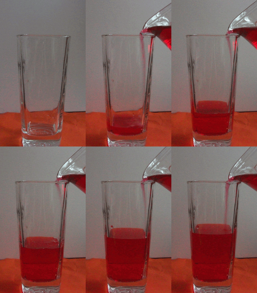
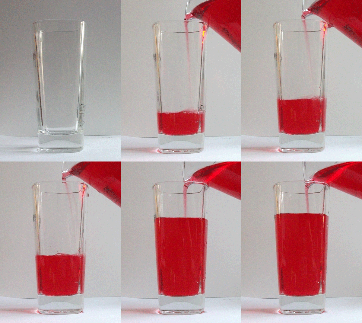
This was my first attempt at creating an animated gif.
1. I set up what I wanted to capture and set my camera up on a tripod.
2. I put my camera on continuous shutter
3. Filled the glass up slowly whilst taking continuous photographs.
4. Open photoshop and load all the images in separate layers. The easy way to do this is  go to file - scripts - load files into stack.
4. Select windows - animation. This will have the first image selected in the box that pops up.
5. Click on the small tab at the bottom of the animation box that says 'duplicate this layer'. To add the second photo click on the eye next to the first image/layer in the layer box.
6. Continue to duplicate the layer and hide the previous layer until you have reached the last photo. Keep the last layer visible.
7. Shift - click all of the boxes so that they are all selected in the animation box.
8. Click on the time selector at the bottom left hand corner of the animation box. Here you can change how much time you want between each photograph.
9. Click on the repetition selector, choose 'forever'. Click the play button to preview the animation. After viewing it you can change the timings between each frame and whether to delete or keep each frame.
10. To save click save for web and devices. Adjust the side, make sure the dither is up to 100% and that the colours are up to the highest. Save as gif. 
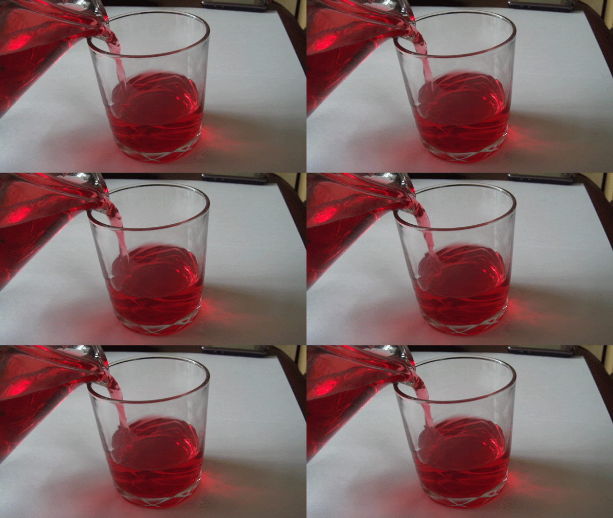
This was my second attempt at an animated gif following the same theme as the one before. I think these worked quite well as my first animated gifs I've made as they were simple but captures what I wanted to without it going wrong. I coloured the water red so that it would be easy to see the water being poured into the glass.  

This was slightly different to an animated gif, I wanted to develop my skills further so I tried to make a cinemagraph. I did this in Photoshop by following a tutorial.

1.. capture a video of the set up where something is moving.
2. Open Photoshop. Press ctrl O to open a file, open the video file that you are using for your cinemagraph.
3.  If the animation box does not pop up straight away then go to windows - animation.
4. Click on the fly out menu ( arrow with 3 lines next to it) and click document settings. Change the Frame rate to 15fps.
5. move the first time line indicator to where you want your video to start from. move your mouse to over the Work area start point, click and hold and hold down shift and drag it to the time line indicator that you just moved. The Work area start point should snap to the line.
6. Capture about 12 frames of the video for the animation. move to the bottom of the animation box and select next frame, click this 12 times.
7. Click and hold the work area end point, hold down shift and drag it to where the time line indicator is now at. Press play to view the frames inside of the selected region.
8. Go to the fly out menu, click trim document duration to work area.
9. Use the time line indicator to find a frame that you want to capturre as the still photograph.
10. Go to select - All. Go to Edit - Copy Merged. Go to Edit - Paste.
11. Press the Q key, or go to the icon with the white circle in the square underneath the colour box. Select the paintbrush tool and select the colour black. Choose the size of the brush depending on your image and with a hardness of 68%.
12. On your image, paint over the areas of the image that you do not want to move.
13. Select the Q key or to icon underneath the colour box. This makes a quick selection.
14. In the layers panel, hide the video layer by clicking they eye next to layer 1. Have the frozen layer selected (layer 2.)
15. Hold the Alt key and click the layer mask button at the bottom of they layer panel.
16. Turn on the visibility of the video layer by clicking the eye next to layer 1.
17. In the animation box, click play to view the animation.
18. Go to the fly out menu once again, click flatten frames into layers. Each frame is now in a layer. throw away the original layers, select the layer with the mask (layer 2, and layer 1), drag them to the trash can icon.
19. Select the lowest frame (frame 0). Right at the base of the right hand side of the animation box is an icon with 3 squares in it, click on this.
20. Go to the fly out menu, click make frames from layers. Click the play button to view the series of frames.
21.  On the first frame Click on the time selector at the bottom left hand corner of the animation box and select no delay.
22.  Click on the repetition selector, choose 'forever'. Press play to view the animation.
23. To export it as an animated gif, go to file - save for web and devices.
24. adjust the file size down for example 600w. in the presets select GIF, selective, dither the image with pattern, select the highest colours, click on covert to sRGB. Save.

I found this slightly harder than the animated gif as it had more steps involved but once I had worked out where all the icons were it was quite easy to follow. I think its a easy way to create a cinemagraph with simple steps. I was pleased with my own one as I like how the water level of the liquid does not increase as the water is being poured in. 

Geraldine Georges inspired experimentation

Geraldine Georges is a Belgium illustrator and graphic designer who uses a combination of illustration and photography. Her images consist of most commonly portraits adorned with shapes and objects such as flowers, bold black lines and areas. In some of her illustrations animals are included as either extras or to become part of the form. 
Below is my hand made attempt of creating an image inspired by Geraldine Georges. I used different materials such as ink, pens and paper. I splatted and dotted the ink around the page then tipped it up and blew the ink so that the ink could spread. I cut around a photograph then cut into it, I wasn't paying particular attention to detail except for when cutting around the eye. As I had a limited amount of time to create this it was hard to make it quite creative so it had to be kept simple but still with comparisons to Geraldine Georges work.
 

Photoshop Experiments
This was my first attempt at using Photoshop to create a Geraldine Georges inspired image.
 To create this I followed a Photoshop tutorial.

1. open the desired photograph into Photoshop, and create a new blank A4 document.
2. Drag the photograph onto the blank document. Holding down shift, re-size the photograph so that it is fairly small.
3. Using the lasso tool or the magnetic lasso tool draw around the area of the picture that you want. To select more than one part hold down shift and select another area.
4. Hold ctrl and click the mouse and click select inverse. press delete then deselect.
5. Using the eraser tool eliminate areas of the image that you don't like, also using the magic want tool so that it snaps to specific parts for a cleaner eraser.
6. Create a new layer. Using the shape tool for a circle for example, draw where you want the shape to be. Drag this layer to below the image so that it will appear behind it. fill the shape black.
7. Create a new layer. Click on the brushes icon and experiment with using the different types to see what works well with the image. As it is as a new layer you can delete it and start again without deleting the photograph.
8. Add colour with the different brushes depending on what works well with the photograph. 
This was my first attempt of adding colour. To begin with I didn't want to add colour as I thought it spoils the photograph, but as I added more colour and drip marks I think that colour added another element to the image. (image below).

I liked the hands on approach to creating a Geraldine Georges inspired piece as I could make it how I wanted it without any obstacles such as brushes. Photoshop however can lead to more creative ideas and colours. The brushes available can vary and for specific brushes they can be downloaded. After doing the two I now think that I prefer Photoshop as its more creative with brushes however it is very time consuming and harder to draw accurate shapes with a cursor. I resorted to using software called X-pen, it allows you to freely draw on a pad which is like drawing on paper which appears on screen. 

Norm Magnusson 'decorating nature'

Norm Magnusson is a New York based artists known for his 'decorating nature'. He used the environment around him for the canvas of his work. He has made a series of work whereby he paints or colours different parts of nature. It varies from coloured stripes on leaves to circles on a stone to splashes of colour underwater. The meaning behind this series is to show and explore the complicated relationship between mankind and nature. We use nature how we see fit to, whether it being using it for profit, making it prettier, keeping it as it is or changing it for the 'better'. By decorating nature it makes people take a second look at what it is, some might interpret it is a new life to what is already there where as others may see it as destroying what is natural just to please others to appreciate nature. 


Here are my own examples of 'decorating nature' - 


Jan Van Holeben style photograph

Jon Von Holeben was born in 1977 and brought up in Germany. From the age of 13 he followed in his fathers photographic career by picking up a camera and experimented with taking all sorts of photographs. His work shows the influence of his parents, a cinematographer and a child therapist. He wanted to create a visual representation of childhood , in his series of 'dreams of flying' he's taken many different scenes that would be of what children dream of. It was produced in 2002 with children from his local neighbourhood in southwest Germany. 

This was my Jon Van Holeben inspired photograph. Working as a group we had an idea and used materials and resources around us to create it. We set up our area in the atrium; using a black curtain as the night sky, cotton wool as clouds, Cut out paper stars, musical instruments floating in the sky as if in the dream. Using materials we created a bed in which four of us we in and the other member of our group was included as part of the dream holding a guitar and wearing a mask.

Markus Kisson inspired pop-up photos

Markus Kisson is a digital artists based in Berlin. Looking at his works I am experimenting with creating my own Markus Kisson pop-up photographs. He would take a polaroid photograph then cut around parts of the photograph and bend it upwards so that they stick out. 

Below is my quick example of a pop up photo -

First I decided what photograph I wanted to pop up, I decided to go with a photograph of a church that I had  taken as my theme is architecture. I Then chose what photograph I wanted as the background, I thought choosing something simple like grass and sky. 
1. I cut around the church
2. folded where the grass ended
3. followed a tutorial as to how to cut the background for pop up tabs
4. Glued the church onto the pop up tab