Showing posts with label Unit 2. Show all posts

Friday, 4 May 2012

Project Evaluation

For this project the theme was encounters, experiences and meetings. I thought of various different ideas to do with this theme. For example family events, crowds, conflict, relationships and growing up. After thinking about the different ideas, I decided to explore the theme of war and past time experiences. 


Within our overall project I worked on another theme of life cycles. I explored the work of Bill Viola and Andy Goldsworthy as their work related well. I liked the way Bill Viola made a film expressing the three stages of life. Andy Goldsworthy's work focused on using the natural surroundings and natural tools to create his work. Following my own ideas of on life cycle, I shot a film roll of gravestones. I think that gravestones depict the idea of life cycle well as at the end of a life is death. I chose my two best photographs then mounted them onto foam board and entered them into the Rotary Club Photography competition. 


For the project encounters, experiences and meetings I explored war and past time experiences through going to the Imperial War Museum and looking at my family history and relatives. I looked at the works of Don McCullin, a photographer. His photographs were exhibited in an exhibition in the Imperial War Museum. I love how he captured the moments within the various war and conflict scenes. As I could not experiment with my own Don McCullin inspired photographs I looked at other artists that I could show experimentation for. Rankin was one of the artists that I explored with my own experimentation of his rankin 'destroy' work. I took photos of myself expressing different emotions then 'destroyed' them in various ways. I experimented with cutting into my photos and adding objects and backgrounds for the images. I then used my experimentations in photoshop to explore different ways of 'destroying' my images.
I looked at the work of Maurizio Anzeri as his work linked well to mine as he involved old vintage photographs in his work. His style was sewing over the faces of the different people. Before I experimented with sewing into my photos I thought I would find it quite daunting to edit and change the faces of my family. After sewing into my photographs my thoughts of sewing into them changed, I found it interesting and experimental to see the effect it had on the photos. To explore my theme of war and past time experiences I experimented on photoshop with 'ageing' my photographs. I added different effects until I was happy with the outcome.  For my final piece I was originally going to make a memorabilia box including different photos and records from the war such as medal certificates and death records and objects from my family such as old dolls. After thinking of how to present my idea I decided to have a mounted sheet of photographs and records with the attachment of a box containing various different objects. I am happy with my final outcome as I think it is presented better than my original idea. I would like to explore the theme of war and past time experiences through a range of different idea and may bring elements of it to new themes and ideas. 


Final Composition Ideas


These were some of my ideas for my final outcome. I decided to combine most of these ideas for my final piece. 

This was one of my original first ideas that I experimented with for my final piece. I was going to make several different 3D shapes with photographs on all sides then arrange them in a creative way so that all sides could be viewed. I developed this idea by thinking about arranging them to look like a family tree, At the top would be my great grandparents, then my grandparents, then my parents then me and my sisters. 


Wednesday, 2 May 2012

Darkroom Experimentation

In the darkroom I experimented with different techniques to see what the outcomes were like. I may carry these forward into using them for my final outcome. 
This experimentation I used the dodging and burning technique. I exposed the plane to one half of the photographic paper then moved it over and exposed the other half of paper. To make it look like there are two planes I dodged the first half that I had exposed so that it would come out with the same contrast and timings as the second plane. However there was a slight overlap in the centre where the two planes crossed. 
I experimented with making reversals of my images, I only experimented with two because I was specifically interested in seeing what the image of the people in gas masks would look like. The newspaper reversal was experimenting with another print. I think that the reversal of the people in gas masks look quite daunting and emphasise on what it would have been like in the war. 

For this print I experimented with solarisation. This was done by exposing my image to the paper for the correct amount of time them putting it in the develop for a few seconds then putting it under a light for a few seconds then putting it in the stop bath for the correct amount of time then in the fix then in the wash. 

For the next two print I experimented with exposing my image on the photographic paper then placing newspaper in the negative carrier then exposing it. I had to half the time that I would usually expose my print for otherwise it would turn out really dark. For this print I exposed the newspaper first before I exposed my print. 
On my second experiment I exposed my print first without the newspaper in the negative carrier, then placed the newspaper back in the negative carrier and exposed it for the remainder of the time. 

Experimentation - Aged Photographs

 I experimented in photoshop to see how I could age some digital photographs that I have taken. I used different layering and blending modes to achieve this look.
Aged Effect:
1: -Open File
- Filter > blur & >surface blur
- Image > adjustments > gradient map (brown > white)
- Image > adjustments > levels (0,0.80,255)
- Image > adjustments > curves ( custom - OP 255, IP 245)
- Image > adjustment > photo filter ( colour - warm yellow, density 30)

2: - Find centre of composition create round selection using elliptical tool
- Select > modify feature selection (80-100)
- Select > inverse
- Filter > blur > lens Blur ( more accurate, Triangle, 10,30,0,0,255,4, uniform, monochromatic)
- Filter > noise > add noise ( 3%, gaussian, monochromatic)

3: Duplicate Background
- Apply grainfilter (12,17, sprinkle)
- Apply overlay blending mode (opacity 50%)
- Add inner glow (screen, 100%,0%, softer edge, 0,250,range 70)
- deselect

4: New layer - scratches
- Multiply blending mode ( opacity 75%, fill till happy with outcome)
- Merge layers

5: new layer - paper texture
- Change blending mode and opacity
Original

Outcome
Original

Outcome
Original

Outcome
Original

Outcome
Original
Outcome

Original
Outcome 


Darkroom Prints - Family and Brighton Photographs

Continuing my theme of the past and war time experiences I took some photos with my SLR that follow my theme. These are photographs are of family members and shots from a visit to Brighton. I experimented with different sized paper to see what the prints came out like.  

For the photographs of members of my family I tried to think of ways in which I can make the images look aged. I took photographs of old photos in albums that I have, to achieve an old look on the photographs I set up a tripod with the camera on, then arranged the photographs so that they were in focus under the camera. I took the pictures with a sheet of plastic over thew images so that the natural lighting would reflect off plastic and show up on the negatives. This created a darkened effect over the detail in the image and removed some of the contrast which is what I was hoping for. I used half a piece of 7x5 paper and a quarter of 7x5 paper. I prefer the smaller prints on the quarter of 7x5 because I think that they look more like how photographs would have been printed in the past because printing was expensive they were often printed on small pieces of photographic paper. 

These images are of my trip to brighton. I tried just to focus on things that didn't look modern, for example the lamp post and the pier. However with the shot of the deck chairs I couldn't crop out the people sitting on the beach. As it was a very sunny day this made the print have good contrast. With the first print of the  lamp post it came out a little too dark so I reduced the time the image was exposed for which resulted in a god contrast print. 

Review of Ideas

How have your original ideas / concepts changed from the start of the project? 
At the start of the project I wanted to explore the theme of memories and the past. As I looked further into this theme I began to build a deep knowledge what path I wanted to go down and to experiment with my different ideas.
How have your original ideas developed through experimenting with techniques, materials and equipment?
My ideas have become more complex and refined through experimenting with different techniques in the darkroom and with different materials. I have experimented with reversals, multiple exposure, dodging and burning and solarisation in the darkroom with my prints.I have also experimented with different techniques on Photoshop such as aging my prints and adding effects.

How have your original ideas developed as a result of researching the work of others?
By researching the work of others my ideas have developed. For example after looking at the work of Don McCullin and Maurizio Anzeri I have thought of new ideas such as focusing on war and using different materials to incorporate into my photographs such as thread like Maurizio Anzeri does.

Do you think your ideas will continue to change and develop as your work progresses? Do you have any further experimenting / research to do that you think might change / improve your ideas?
Yes, I think as I do more experimentation and continue looking into artists and photographers that focus on war and past time experiences I will have more ideas and developments for my work and final outcomes.

    Maurizio Anzeri Experimentation

    I was inspired by Maurizio Anzeri to experiment with sewing into my own photos to see what effect it caused. I Tried to experiment with different colours instead of using the styles that Anzeri does by using one colour in different shades on each individual. Before I did the experimentation I thought I wouldn't like the idea of sewing into my family's faces because it is almost as if I am destroying and changing a memory. After experimenting with it my feelings have changed, I don't think it changes the memory or destroys the faces, I think of it more as trying new ways of making the images have more character.  
    This was my first experimentation of sewing into my photographs. I made it quite simple by only using a few colours and sewing across the whole faces. 

    This was my second experimentation which I think worked better than my first experimentation because the stitching was more complex and I used a wider range of coloured thread. I wanted to see what patterns I could create and what impact they has on the image. 

    Tuesday, 24 April 2012

    Maurizio Anzeri


    Maurizio Anzeri was born in Italy 1969 and now lives and works in the UK.
    He makes his portraits by sewing directly into found vintage photos. Previously he used to do ink drawings with the photographs and wondered what it would look like to be stitched into. He put tracing paper over the photo and drew on the face until it develops. Sometimes the images come to him straight away due to the detail in the photographs but he mostly spends his time drawing on them. 
    Once the drawing is done he pierces the photo with a set of needle like tools he invented and takes the paper away. The stitching on the images can obscure the faces because of the lighting and the amount of stitching used. 


    Anzeri's work has influenced me to experiment with my photographs in a way that I wouldn't have considered before. I like the idea of mixing traditional photographs with a material such as thread. His works links to my idea because he uses old vintage photographs in his work which is what I am exploring. 


    I like the way he's used brightly coloured thread over the sepia or black and white photographs as it makes the images more modern with the added colour. In my own opinion there is something daunting about sewing into people's faces but I think once I have experimented with sewing into my own photographs my preconceptions of this idea might change. I like the fact that he hasn't made the marks directly to the shape of the face, he has experimented with different ideas and shapes but focusing it only around the face area. I like the way it provokes different feelings and emotions when people see it, some have said they find it fascinating how the combination of two completely different materials have been used to create a interesting final outcome, whereas others say they hate the idea of sewing into faces as they find it disturbing. 

    Monday, 23 April 2012

    Vintage Photographs

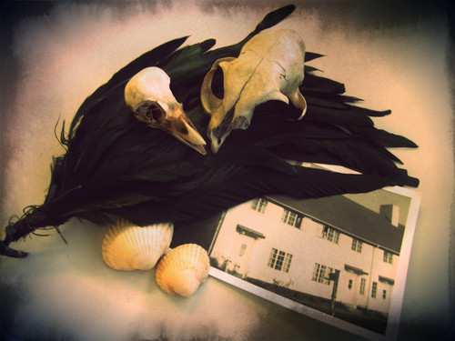
    Following my theme of past & war time experiences, I experimented with taking some photographs of arranged collected photographs and objects. 
    This was my first experimentation, I arranged the objects in a simplistic way simply to see what the outcome will be. 

    I like that this composition is not arranged and taken taken from a different angle. 

    A close up of a postcard.

    Close up of postcard, bird scull and photograph of a road.

    I tried to make this composition to focus on a holiday or a trip to the coast. I arranged the objects to fill  area. I then edited this photograph by adding a boarder and photo effect in a programme called pixlr-o-matic.

    This is my favourite composition because I like the arrangement of objects and think that the photo effect works well with the image. 

    Darkroom Prints

    As I am focusing on the theme of the past and war time experiences I took some photos with my SLR that follow my theme. These are photographs that I had taken in the Imperial War Museum. I hoped to achieve high quality prints with good contrast. 


    I tried to achieve a shot as if the planes were being aimed at. I wanted the planes to be viewed through the crosshair but  because of the angle it was positioned at the shot would have had a lot of background image and not a lot of the different exhibits I wanted in the shot. 
    I took a photograph of one of the front pages of a newspaper. I chose this one because out of all of the newspapers this one had more working on it linking to the war. It is quite grey because the light in the room was quite dim and I didn't have an inbuilt flash on my camera.
    As I looked around at the different exhibits I chose which ones would make a good composition. I wasn't expecting this image to come out with good contrast because the lighting was not that great around the machinery. 


    The contrast is good but the print is a bit grey, to improve this I would change the timings. 


    The contrast on this print is good. I had the light on f16, filter on 5  and exposed for 7seconds.


    I think that the contrast is of a good standard, this is helped by the lighting on  the subject matter.


    This print is has quite good contrast which I didn't expect seeing as there was on direct natural lighting directed on it. 


    The contrast on this print is quite good, but in my own opinion I think that it is too dark. However I am just judging it by this scanned in version whereas the original print doesn't look as dark as this.
    This photograph has come out grey, this is due to the lighting in the room with the newspapers was quite dim. I added a filter to make the image have more contrast.
    These next set of photographs were taken of different posters and pictures around the museum.The photographs didn't come out that sharp because the poster photos were enlarged and therefore were not as sharp as a primary photo.


    This photograph came out slightly washed out because the image wasn't exposed for long enough.


    This was my second attempt which came out with more contrast than the first.


    Don McCullin

    Don McCullin born 9th October 1935 is an internationally known British photo journalist. He is mainly recognised for his war photographer. In 1959 a photograph that he had taken of a local London gang was published in the Observer. This lead him to work for the Observer for several years. Between 1966-1984 he worked for the Sunday Times magazine. His assignments included Biafa, the Belgian Congo, the Northern Irish 'Troubles', Bangladesh, The Lebanese Civil War, El Savador, and The Russian Invasion of Afghanistan. His most famous photos are of Vietnam and Cambodia.
    On visit to the Imperial War Museum in London I took a look around the 'Shaped by War' exhibition by Don McCullin. It consisted of various room exhibiting his photographs taken when working for the Sunday Times. His photographs were very moving has he had captured the emotion and atmosphere in every image. His use of spacing was great considering he was amongst war and conflict taking place. His photographs showed the realisation of what took place and what is still happening now in some countries. One set of images made me feel really emotional and disgusted at what had happened was one photograph being of a family standing by a staircase then the image next to it of that family all lying on the floor after they had all been shot. I love the fact that he uses black and white photography as it makes the image more powerful; his work influenced my choice of photographs for my final idea. 

    Monday, 9 April 2012

    Initial Idea

    I've thought of different ways I can explore the theme of encounters,experiences and meetings by creating a mindmap of ideas.
    An area that I am interested in exploring is past and war time experiences. My visit to the Imperial War Museum in London will assist my idea that I am exploring. I hope to shoot a whole film roll of the different exhibits. 

    Tuesday, 20 March 2012

    Rankin Inspired Experimentation

    I was inspired by Rankin to experiment with create my own 'Destroy Rankin' images. I started by taking self portrait photos on Photobooth. I printed them off then cut them up and experimented with using different objects and mediums to 'destroy' the photographs. 
    I cut around my image and cut out my hand. I cut out the background pattern on  purple  paper and placed it on top on yellow paper. I then placed around my image with space invaders and smiley faces I had made. 
    On a sheet of clear plastic I drew some doodles onto the plastic then placed it on top my image. 
    I drew cat features onto my image then cut it into squares and placed in on the background I had used previously for another image. I then scattered origami stars that I had made around the image. 
    I scrunched the photo up then ripped it into sections. 

    I developed my previous image by placing photos of me when I was little behind the torn up photo.

    I experimented further by using Photoshop to edit and 'destroy' them further. I made my own brushes and experimented with different layer modes and blending options.
    I added flares of light and different star brushes.

    I added coloured feathers and glowing stars.